
Start exploring our new top charts interface
A couple of months ago, we released our new top charts interface to allow more customisation. Even though this new addition is great to compare different charts, we noticed that there was still room for more features! Since sometimes you just want to see what is the situation in other markets, we improved our interface to allow more flexibility and a better user experience. This blog will show you the new interface and re-insist on the importance of top charts in your analysis.
Try the exploration mode
We recently launched an additional section to our top charts feature, a page allowing you to quickly switch from one top to another. This section has been designed to allow more flexibility and get quick insights on different markets.
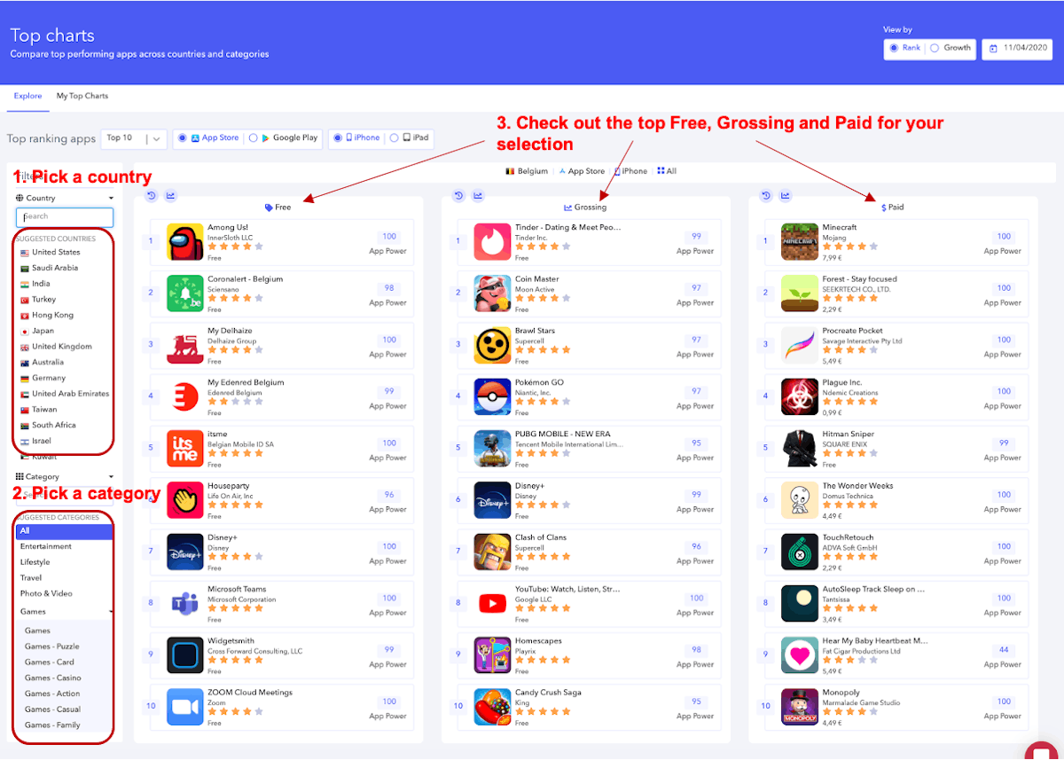
This new design allows you to go from one top chart to another and change easily the country or the category analysed in one click.
This interface will show you a list of suggested categories and countries based on your followed apps. For instance, you may be following a lot of different apps in many different categories and countries, our new interface will automatically suggest the countries and categories where you follow most of your apps, so that you have a tailored experienced. .
Of course, with this new interface you will still be able to jump in the more personalized section which is “My top charts”:
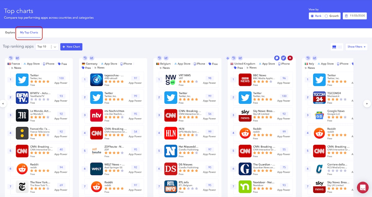
As a reminder, this section will allow you to save up to 9 top charts of your choice. This view is especially useful when you want to monitor multiple charts at the same time without having to switch from one top to another to have a full understanding of the situation.
Now that you have a better understanding of our new structure, we can review some major benefits you can take away from this section using all the functionalities this interface has to offer!
Get the best from this interface
- Identify competitors and understand the context
By checking top charts you may learn some valuable insights in a specific market. Valuable information that will make you understand in what context your app is evolving in.
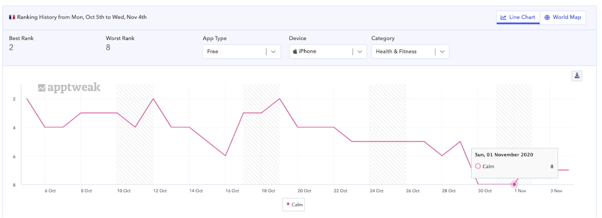
Let’s take the example of the app Calm in France. Calm is an app that has been ranking in top positions for the past week. But when we look at recent rankings, we observe a slight decrease in its rankings. This may come from several reasons but maybe by looking at the top apps in this category, we could better understand what is the current trend.
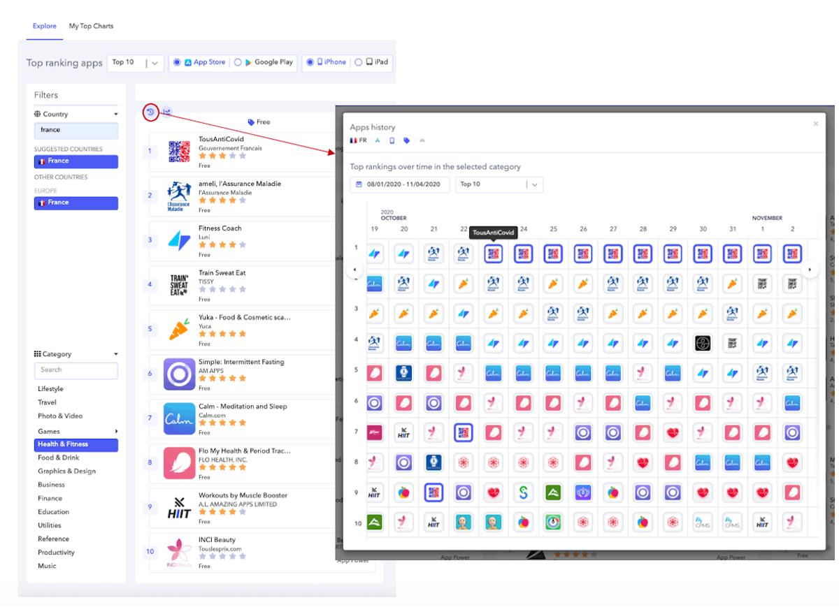
When we look at the apps history view, we see that this period is linked to the rise of the state-owned app, TousAntiCovid (a covid-tracker app). As a result, this app reached the first position after new lock-down regulations were about to be announced, on the 28th of October. In addition, we see that fitness apps are also gaining top positions which may be a sign that the trend in France isn’t favorable to meditation apps but more to fitness apps. This new lock-down seems to make french people want to do more sports at home instead of meditation.
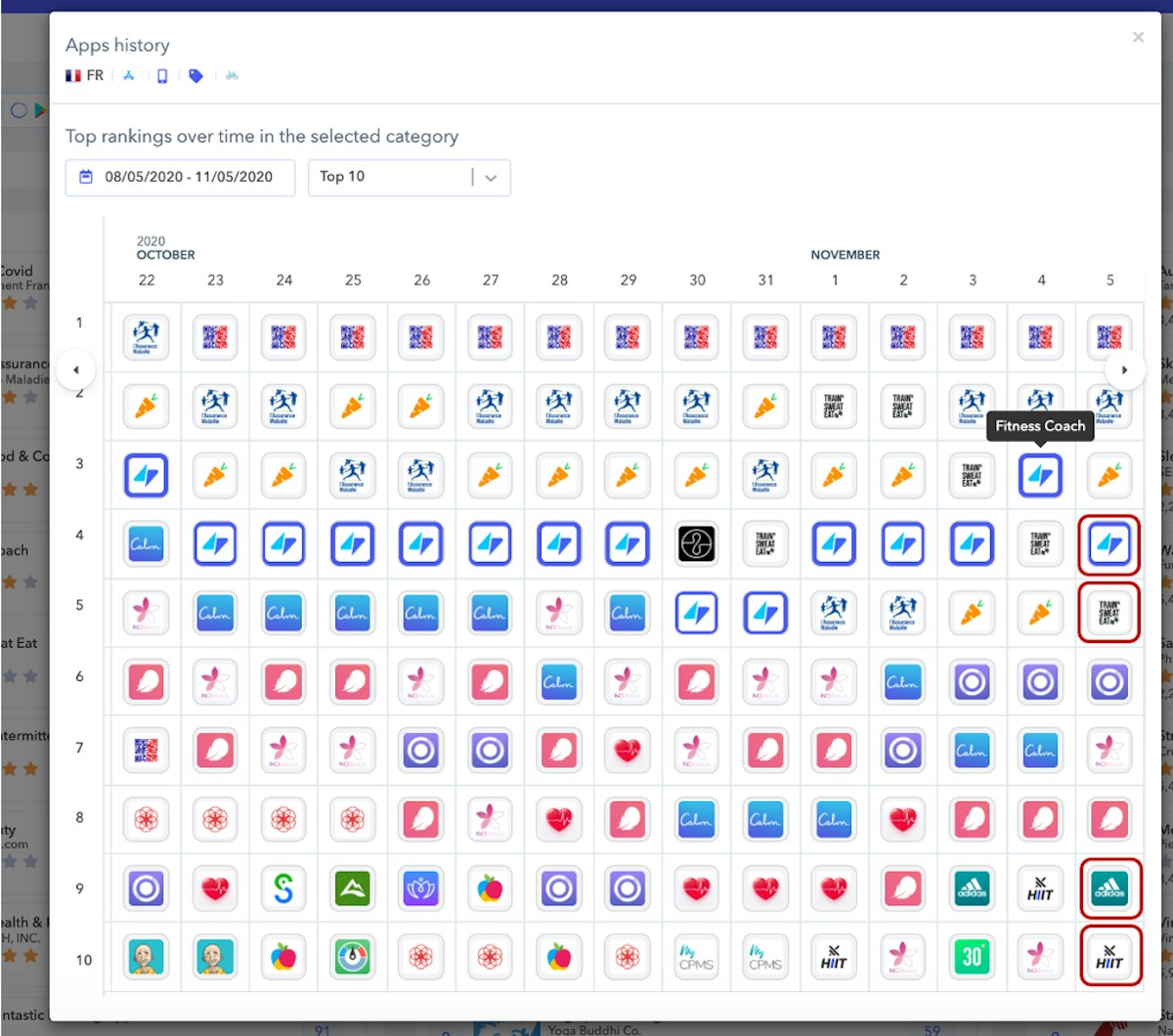
Now we can see 4 different fitness apps in the top 10 (Adidas Runtastic, Workouts by Muscle Booster, Train Sweat Eat and Fitness Coach)when there was only one 2 weeks ago.
As a result, Calm should be aware of these contextual changes visible in top charts in order to adapt its strategy.
- Visualise trends and save your best top charts
Another valuable insight you can get from this interface is to analyse trends across multiple countries. This is crucial if you want to understand how your app is performing across countries and if a common competitor may be stealing your downloads.
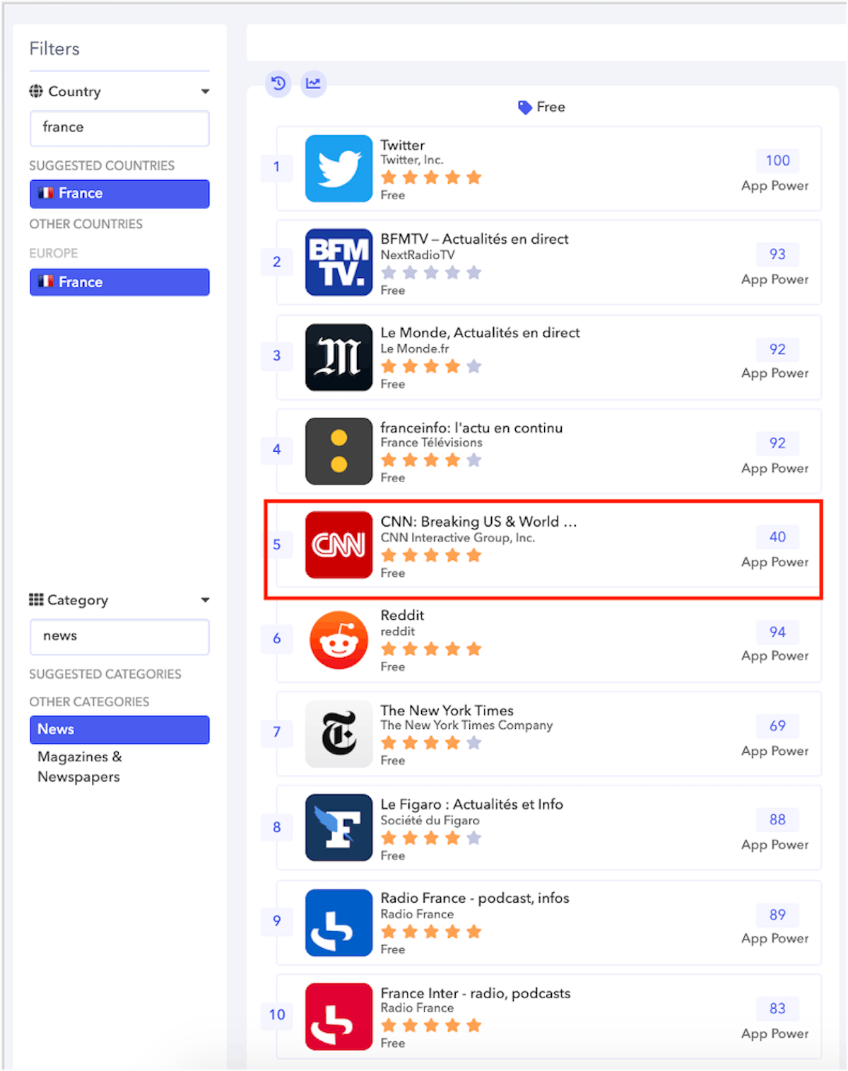
For instance here, you can see that with the U.S elections, the app CNN became trending in France on the 3th of November:
You may wonder if this is the case in multiple European countries. For that purpose you can decide to work with the cross-top charts view in My Top Charts section:
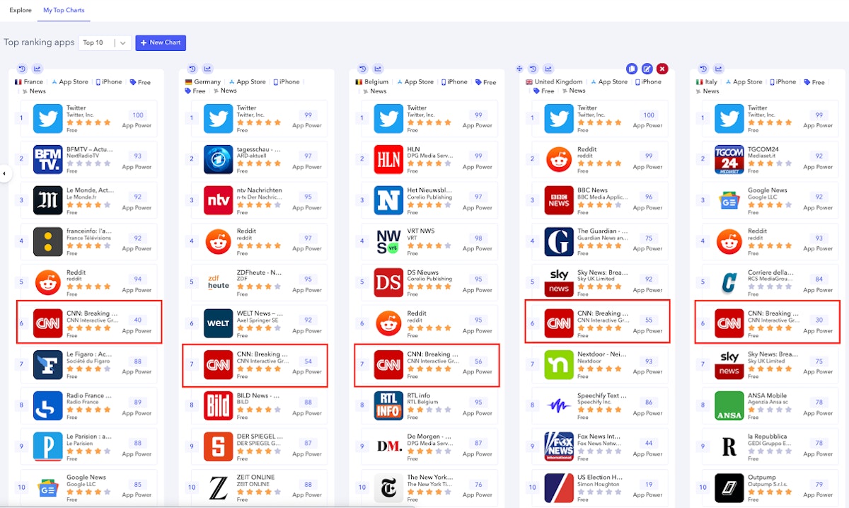
As shown in the screenshot above, you can quickly spot that the app CNN is reaching top positions. This can be seen in multiple countries such as Germany, Belgium, the United kingdom, Italy or France.
It is even more explicit when you look at the rank history chart in France for instance:
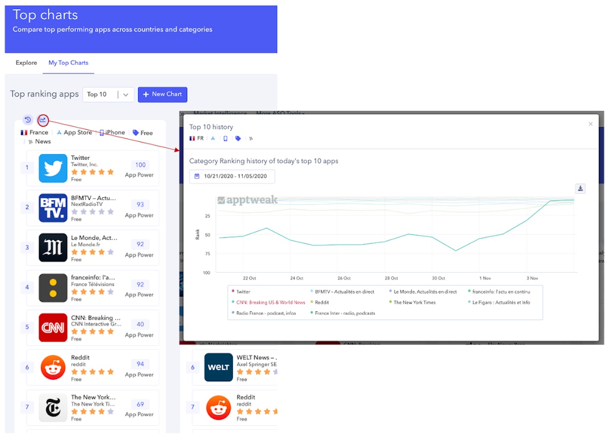
The app went from rank 50 to rank 5 on the 4th of November. It is very visible that during this period, this app CNN is an outsider that may stay at top positions as long as the u.s. elections will be under way.
Enjoy our new interface now!
To sum-up, we added a new section to our top charts feature to provide a better user experience when you want to explore multiple charts. In addition, you can still enjoy the “My top charts” section to monitor the most relevant top charts to your analysis and have a better cross view analysis of the situation. Don’t forget all the insights you may get from these top charts, here is a short list to name a few:
- Identify future competitors
- Identify specificities of each market
- Deepen your understanding of a specific market
- Make a cross country analysis of your top charts
- Look out for potential apps to invest in
Go to the top charts feature in the more ASO tool section and discover your own insights!


 Georgia Shepherd


 Olivier Verdin

 Jonathan Frisch

