
Design Creatives For Your App: ASO Best Practices
In the vast realm of app development and marketing, mastering ASO is non-negotiable for ensuring your mobile app or game not only stands out in a crowded marketplace but also captivates the target audience effectively. Along with metadata optimization, the creatives of your app – through its icon, screenshots, and preview video – plays a crucial role in captivating potential users.
It is crucial that your app/game’s creatives stand out and resonate with your target user base. Users will spend only a few seconds analyzing your game or app’s creatives before moving on to a competitor. Your creatives must stand out while highlighting the features and value propositions that will resonate with them the most.
In this blog, we will highlight the ASO best practices to help your app creatives stand out from the competition and target potential users effectively.
1. Create an effective icon
Design an impactful app icon
Your app/game icon is the most visible visual element, so it needs to be impactful. A well-designed icon not only captures attention but also conveys the essence of your app or game effectively. Here are some tips for designing an eye-catching and memorable icon for your app:
- Ensure your icon is unique and recognizable. The mobile market is incredibly competitive, and you want to ensure your icon stands out from competitors.
- Your icon should be concise and memorable. Your app icon shouldn’t be too simple, but it also cannot be too complicated, as that may distract users. The icon should be attention-grabbing without cramming too much text, imagery, or patterns into it.
- Ensure your icon communicates the right message about your game or app to users. This will likely be the first creative element users see and form their initial expectations of your game or app based on the icon. Select colors and imagery that align with your game’s identity.
Have a look at these 10 expert tips and best practices to design an optimized app icon
Reflect your game’s identity with your icon
Before designing an icon for your mobile game, make sure you understand your game’s identity and that it communicates the right message.
- To keep the icon simple, include one image with a single focus point that conveys your game’s identity. Consider using an image synonymous with your game, such as the logo or a popular character, to make your icon unique and representative of your game.
- When selecting colors, consider the category of your game – bright and vibrant colors may suit a casual game for all ages, while darker colors may be more fitting for a fantasy RPG targeting mature audiences. Ensure the chosen colors align with your creatives’ guidelines.
2. Create engaging screenshots
Your app/game screenshots play a significant role in conversion and are among the primary creative elements users analyze to set expectations for your app. The first three screenshots are especially crucial, as they are the most visible.
Capture value with your app screenshots
On iOS, if the screenshots are in portrait mode, only the first three are visible, and in landscape mode it will just be the first screenshot. Given that most downloads originate from search results, your screenshots heavily influence your app’s conversion rate.
Google Play has updated its search results UI, allowing users to see your screenshots before clicking through to your store listing page. This change emphasizes the impact of your screenshots on your app’s visibility.
Here are some tips for producing attention-grabbing app screenshots:
- Ensure your screenshot text is large enough to read on a small device
- Highlight the most popular value propositions and features within the first three screenshots
- Make sure your screenshots are attention-grabbing and stand out from competitors
- Focus on one feature or value proposition per slide, and make sure your in-app imagery supports the accompanying text
- To make the screenshots more engaging, emphasize different components of the UI, incorporate other design elements, use a splash screen or use different sizes, fonts (such as sans-serif fonts), and colors for your copy
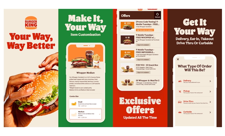
Design the best app screenshots with these tips and best practices
Showcase gameplay & appeal with your game screenshots
When deciding whether to use landscape or portrait mode for your game screenshots, it is important to understand the pros and cons.
- Newer games may opt for portrait mode to quickly highlight more gameplay, features, and value propositions. Conversely, older games with more brand recognition may prefer landscape mode for its larger size and increased attention-grabbing capability.
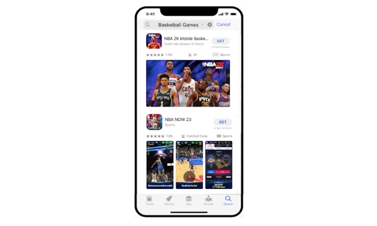
- Regardless of your choice, make sure to highlight gameplay that excites users.
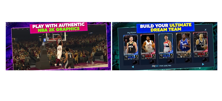
- Capture gameplay imagery that showcases your game’s best aspects. Users generally resonate the most with your game’s characters. If applicable, don’t hesitate to put your game’s characters front and center. If your game incorporates any progression system, communicate that progress to assure users they have something to work towards (players love a sense of accomplishment while playing games). This will make your screenshots more captivating and help differentiate your game from competitors.
- Just like with your icon, choose a color palette for your screenshots that effectively communicates your game’s identity. When implementing copy in the screenshots, ensure it maintains good color contrast with the background for better visibility. You can also add captions to enhance the highlighting of your features and value propositions.
Expert Tip
Leverage AppTweak’s ASO Creatives Explorer to gain insights and learnings from the creatives that different games are using in your category. This feature helps you identify the dominant creative trends in specific categories and markets.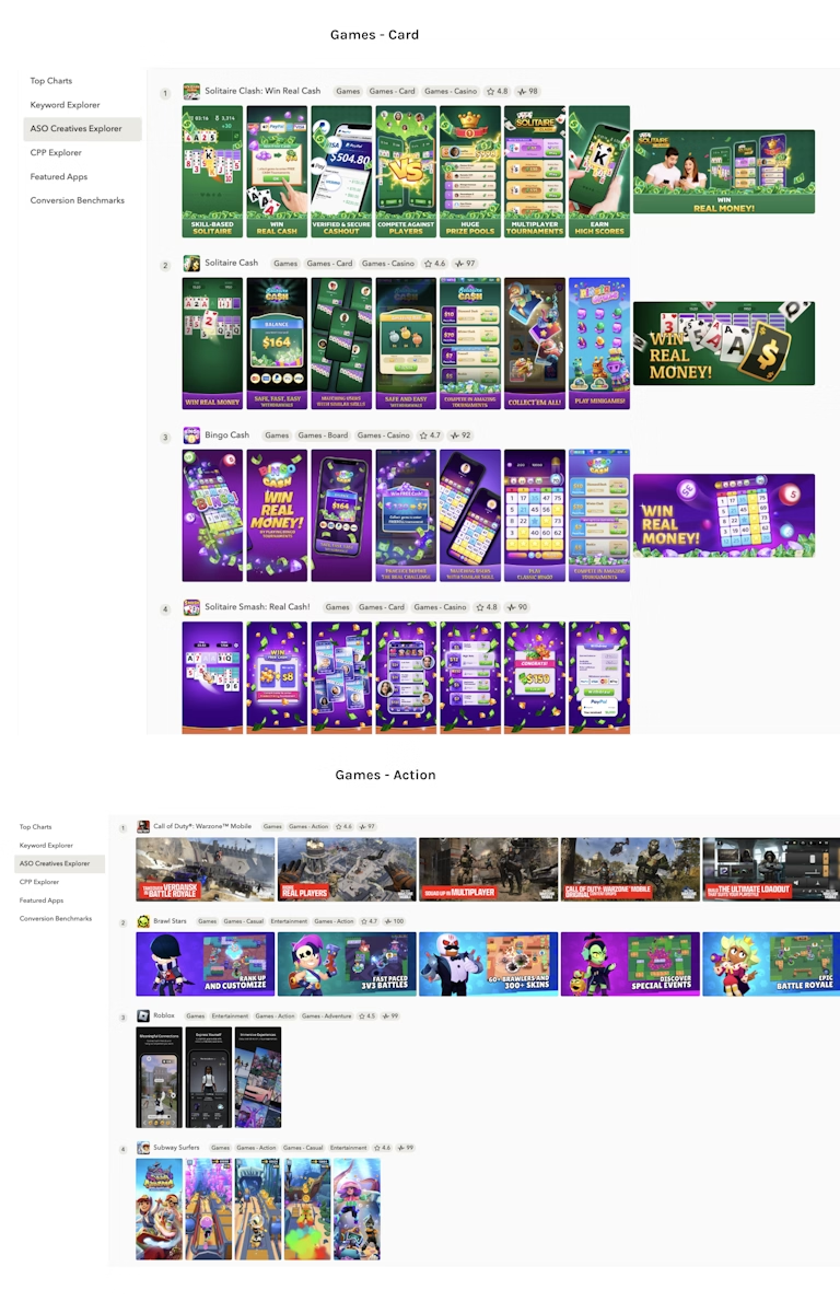
3. Create effective preview videos
App preview videos play a significant role in app store marketing, particularly for mobile games. If you have a video that will appear in the search results on iOS and can take the lead in Google Play, your preview video has the potential to profoundly influence your conversion rate and visibility.
Follow these tips for creating preview videos that capture attention effectively:
- You do not have a lot of time to get users’ attention. Make sure your video starts off with compelling content to keep users engaged.
- Videos do not autoplay on Google Play all the time. This means your feature graphic should compel users to play your promo video. Make it appealing and convey a core value proposition that will resonate with users.
- Showcase real gameplay or footage from your app or game.
- Create a compelling video without sound, as most users will not have it turned on.
- Each segment of your video should focus on a different element or feature of your app or game.
- Make sure your video has no time-sensitive content. If it does, ensure you update your video once that time-sensitive element has passed.
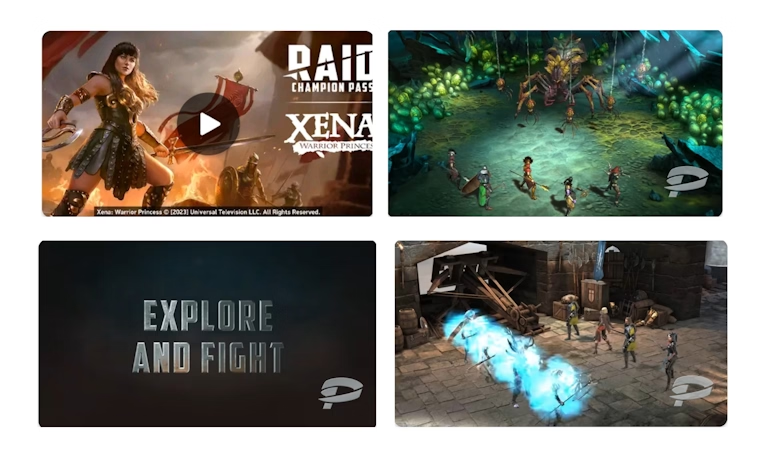
Differences in preview videos between iOS & Google Play
- On iOS, each video can be up to 30 seconds long, while on Google Play, there are no length restrictions.
- Google Play only allows landscape resolution, while Apple accepts both landscape and portrait.
- On iOS in the search results, if your video is in portrait mode, it can appear in the place of your first screenshot, with your second and third screenshots showing up next to it. If the video is in landscape mode, it will show up in the search results instead of your screenshots.
- On iOS, you can upload three videos for each localization, while on Google Play, you can only upload one video.
- Videos on Google Play also have to be uploaded to YouTube first.
What to keep in mind for designing preview videos for games?
Users will analyze preview videos to understand the type of gameplay they can expect, similar to screenshots.
- Highlight the gameplay, features, and value propositions that will resonate most with users.
- With only a short time to capture their attention, start with showing the most compelling elements/features first.
- Make sure you are properly setting up expectations of your game in the video. If users expect one thing and see another, they may uninstall your app or leave a negative review.
4. A/B test your creatives
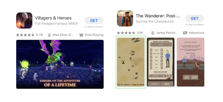
A/B testing in ASO is a critical strategy for app developers aiming to enhance their app or game’s visibility and conversion rate on both iOS and Google Play. By comparing different versions of an app’s page elements – such as icons, preview videos, and screenshots – developers can identify which variations most effectively attract and engage users.
While Google Play developers can A/B test metadata & creatives with store listing experiments on the Play Store, those on the App Store can leverage Apple’s native A/B testing tool product page optimization (PPO) to test up to 3 variants of their app page.
When comparing Apple’s PPO with Google Play’s store listing experiments, a few key differences deserve our attention:
- Scope of testing: Apple restricts tests to creative assets, whereas Google Play extends the capability to A/B test both short and long descriptions.
- Process for initiating A/B tests: For PPO, developers must submit their creative assets for Apple’s review before going live, whereas Google Play store experiments can be launched at any time without prior review.
- App version requirements: Android allows you to test new icons without rolling out a new app version, whereas PPO icon tests require the inclusion of the icon in the new app build’s binary.
- Duration of tests: PPO tests have a cap of 90 days, while Google Play experiments can continue indefinitely.
When you develop an A/B testing plan, you’d want to make sure:
- You’ve a strategy in place and you’re not randomly testing elements
- A/B test one element at a time to confirm that changes are causing the observed results
Also, ensure each A/B test builds upon the previous one. Here are some elements you can A/B test:
- The order of your screenshots
- The gameplay, features, or value propositions you highlight within the first three screenshots
- The background color
- The type of characters you highlight in your screenshots
- Landscape vs. portrait mode
Expert Tip
On AppTweak’s ASO Timeline, you can monitor PPO tests across any app or game on the App Store. It allows you to see which creative elements your competitors are A/B testing and obtain powerful insights to increase your competitive advantage (also available for A/B tests on Google Play).
ASO Beginner's Handbook
In this handbook you'll find everything you need to know about ASO, app store ranking signals, how ASO is different for the Apple App Store & Google Play and how to get started.
Download the handbook5. Optimize creatives for seasonality in the app stores
Seasonal impact on app performance
For apps, there are plenty of seasonality opportunities that you want to take advantage of, depending on the category your app is in.
- It is important to understand when your app experiences seasonal spikes. If you have an accounting app, for instance, understanding when the tax-related seasonality trend occurs is crucial. From October to February, searches for “free tax usa” increased by 400% in volume. This data can help you strategize when to update your creatives to prominently feature your tax-related features. The seasonality battle is won early! If you’re too late, your competitors will beat you to the punch. However, by updating your creatives for seasonal events just before they become popular, you can gain a competitive edge.
- It is also important to identify major holidays and how they impact your app’s seasonal strategy. Black Friday and Cyber Monday present huge sales opportunities. If you have a sale or event related to Black Friday and Cyber Monday but don’t highlight it in your app/game creatives, users may assume you’re not offering significant promotions and move on to a competitor.
- When it comes to highlighting seasonal events within your creatives, it’s usually best to let the event take up only a portion of your creatives. For example, if you have a retail app, you don’t need every screenshot to be about your Black Friday promotion. Since other competitors likely have similar promotions, you still want to emphasize the features and value propositions that set your app apart from the competition.
Check out these app store seasonality tips & trends to prepare your app/game for the holidays
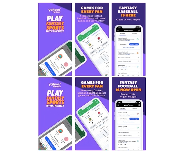
Capitalizing on seasonal trends for games
It’s crucial to identify if your game sees seasonal increases in player interest. For example, a basketball game might attract more players during the NBA season. Also, when a popular console or PC game that isn’t available on mobile gets released, mobile games with similar themes could see a boost in searches. If your game has similar gameplay and ranks well for specific terms, featuring this gameplay in your creatives can be beneficial.
Games differ from apps in that their seasonal increases often coincide with times when people are not working or at school. Notably, during holidays and summer breaks, games tend to experience significant boosts in downloads because people have more free time. Additionally, games see a consistent increase in downloads over weekends.
This means that when your game has an update or event, it’s smart to promote these features during these peak times. This strategy is similar to what’s recommended for apps. Make sure these updates are prominently displayed in your creatives, along with showcasing the unique gameplay, features, and benefits that differentiate your game from others.
Expert Tip
Monitor and analyze your competitors’ creatives’ strategies (which elements they are A/B testing or what kind of in-app events/promotional content they’re running) to understand how they adapt for seasonal promotions, such as Christmas or Halloween. This can help you prepare your creatives in advance. On our ASO Timeline, you can choose a particular date range and see if your competitors have carried out specific creative strategies during that period.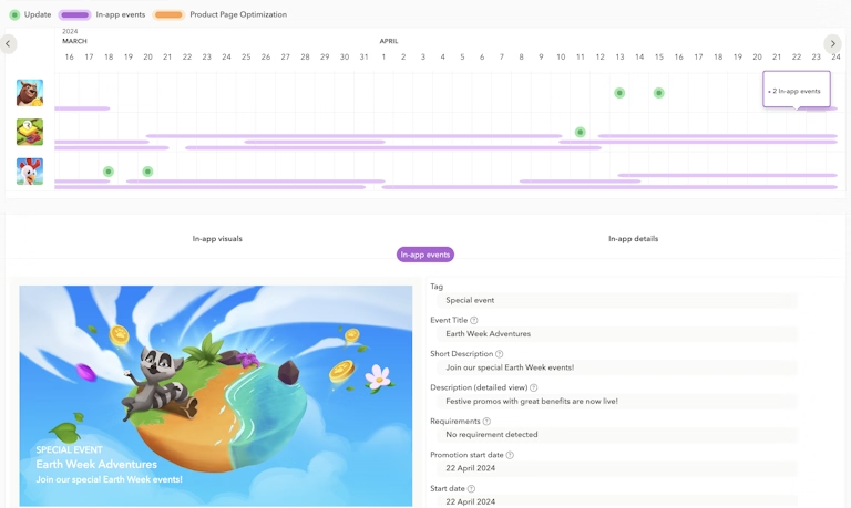
6. Localize your creatives for global success
Get featured on international stores with app localization
Localizing your creatives is more than just translating the text into another language. Creatives resonate more with users if they offer an experience that users can relate to. Creative optimization is key to improving your app’s visibility on the App Store and Google Play. Both the stores factor in an app’s conversion rate when determining its placement.
- Make your app more noticeable than others
- Show the algorithms that your app is market-friendly and deserves a top spot in search results
- Increase your chances of being featured by following store guidelines for designing compelling creatives
Each market has users with distinct preferences and needs. For example, users in the United States may resonate with different aspects compared to users in Europe or Japan.
- If your app features various elements, try to understand which features users in specific markets leverage the most. Use these insights to ensure that your screenshots in each market prominently highlight the features that resonate most with users.
- Considering seasonal events is also crucial. For instance, Thanksgiving is a US-focused holiday, so adding a Thanksgiving theme to users in other markets outside the US may not make much sense. In the case of an accounting app, different markets will have varying tax filing deadlines, impacting the implementation of your seasonal strategy.
Design culturally relevant game creatives
For games, understanding the design and metadata elements that resonate with users in different markets is crucial. Users in one market may appreciate a game for its in-depth progression system, while another market may prefer the story and characters. Identifying this allows you to choose the gameplay, features, and value propositions that should be prominently highlighted in different markets.
When localizing your game for different markets, consider the following:
- What type of gameplay, features, or value propositions should you highlight prominently?
- What type of visual elements, such as gameplay and characters, will users resonate with?
- How should you highlight those visual elements?
- What type of font should you use?
- What type of background colors should you go with?
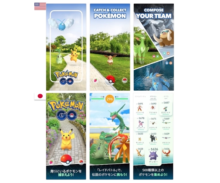
In the given example, we see that Pokemon GO‘s US screenshots are concise, highlighting various gameplay elements in each screenshot. The font is consistent in size and color. On the other hand, Pokemon GO in Japan has more intricate screenshots, emphasizes different imagery, showcases various gameplay aspects, incorporates a text box to highlight copy, and uses text in different colors.
Summary
Your creatives play a pivotal role in determining the performance of your app or game. It’s crucial to conduct thorough research to produce creatives that resonate with your target user base. Creatives are not static; they require continuous A/B testing and updates. Neglecting this aspect can lead to a stagnant conversion rate, negatively impacting your app or game’s visibility and performance. Here are the key takeaways:
- Focus on the uniqueness and clarity of your icon to make sure it communicates your app’s core identity effectively. For games, choose a standout image for your icon that represents your game’s core, and consider the category of your game when selecting colors.
- Optimize your app’s conversion with crisp, feature-focused screenshots. Prioritize clarity, highlight key benefits early, and ensure text is legible on all devices. For games, emphasize characters and gameplay to resonate with users, and use captions effectively to boost feature visibility.
- Start with showing engaging content in your preview video to immediately capture attention. Showcase real gameplay or in-app experience and make sure the video is effective even without sound. For games, your preview video should highlight key gameplay elements and features upfront to accurately set user expectations and drive engagement.
- Leverage A/B testing for your app/game icons, videos, and screenshots to improve visibility and conversions. Use Google Play’s store listing experiments and Apple’s native tool product page optimization to understand which version of your app store elements resonate best with users.
- Capitalize on seasonal trends by updating your creatives ahead of peak times. For apps, identify seasonal spikes relevant to your category – like tax season for accounting apps – and tailor your creatives accordingly to gain a competitive edge. For games, leverage periods of increased downloads, such as holidays and weekends, by highlighting updates or events in your creatives that showcase what sets your game apart.
- Localize your app’s creatives to resonate with global audiences by tailoring content to reflect local cultures, preferences, and seasonal events – beyond mere translation. Also, understand and leverage market-specific insights to design compelling, culturally relevant creatives that highlight the most appealing aspects of your app or game to users in each market.


 Oriane Ineza

 Georgia Shepherd

 Micah Motta

 Lina Danilchik

 Alexandra De Clerck

 Simon Thillay