How to Localize Your App for Japan
Japan has become one of the largest markets for mobile revenue. Localizing your apps and games into Japanese then becomes an increasing priority. So, what do you need to take into account when localizing your app/game for the Japanese market? We’ve gathered for you all the information and tips you need to know to localize your app/game successfully.
Why to localize your app for Japan?
Many Japanese users prefer local apps over foreign ones due to limited English fluency.
To rank well in the App Store or Google Play, it’s essential to localize your app into Japanese. This not only boosts download conversions but also enhances your app’s discoverability. Localization can even boost your chances of getting featured and ranking for relevant keywords.
Yet, visibility and appeal to Japanese store users involve more than just translation. It requires understanding of their mobile design preferences, culture, sensitive topics, and language rules.
Consider the following key elements when localizing your app for the Japanese market.
Discover which languages are the most impactful to localize your app or game into
Metadata localization
1. Language
- Japanese is a very concise language. Its grammar does not require spaces between characters, and words consist of sometimes only one or two characters. This means that for the same amount of characters, you can fit in more Japanese words than you could for English words.
- The Japanese language consists of three distinct alphabets – hiragana, katakana, and kanji that have a high search popularity. That means that for any given English word, there might be several ways to say the same thing. We recommend putting the relevant high-volume keywords that are written informally in the keyword field. For example, in Candy Crush, there is both “きゃんでぃくらっしゅ” in hiragana and “キャンディクラッシュ” in katakana.
2. Title & subtitle
- Put a space between each keyword like with English, as it helps with keyword indexation and lowers the risk of rejection for keyword stuffing. For example, the title “キッズ無料ゲーム,” which means “kids free games” has a high risk of rejection as it seems to be just adding keywords and not forming a sentence. So, adding some postpositional particles such as “や,” “が,” and “の” or one predicate will make your title seems more natural in Japanese and ensure clarity. For example, in this case, it is better to have “キッズ向けの無料ゲーム” meaning “free games for kids.”
- Use relevant keywords that are written formally regardless of search popularity. In a few cases, depending on how you want your brand to be perceived and your targeted audience, you can use everyday words that the user is more likely to use when searching. For instance, for a more friendly app or game, it’s better to use the Japanese version of the English word “chat” (チャット) rather than “communication” (コミュニケーション).
Expert Tip
For long app titles, Japanese developers tend to create an abbreviation to increase brand presence. For instance, the popular app Puzzle & Dragons uses “パズドラ,” meaning “pazudora” as an abbreviation.3. Keyword field
Even though Japanese words need no space, it is important to separate each keyword by a comma in the keyword field to maximize exposure in the Japanese app market. For example, “video editing” has no space in Japanese “動画編集” unlike in English. Still, it is better to separate the two words by a comma in the keyword field like this “動画,編集”.
Discover how you can increase your app downloads with localization
Creatives localization
When it comes to creative assets (including icons, screenshots and videos), Japanese app store users prefer the “Japanese look” for games. The manga and anime style are highly popular in Japan.
As for apps, it is important to localize UIs and models. Add anime elements or Asian models in your creatives to make them more appealing to the Japanese users.
1. Icon
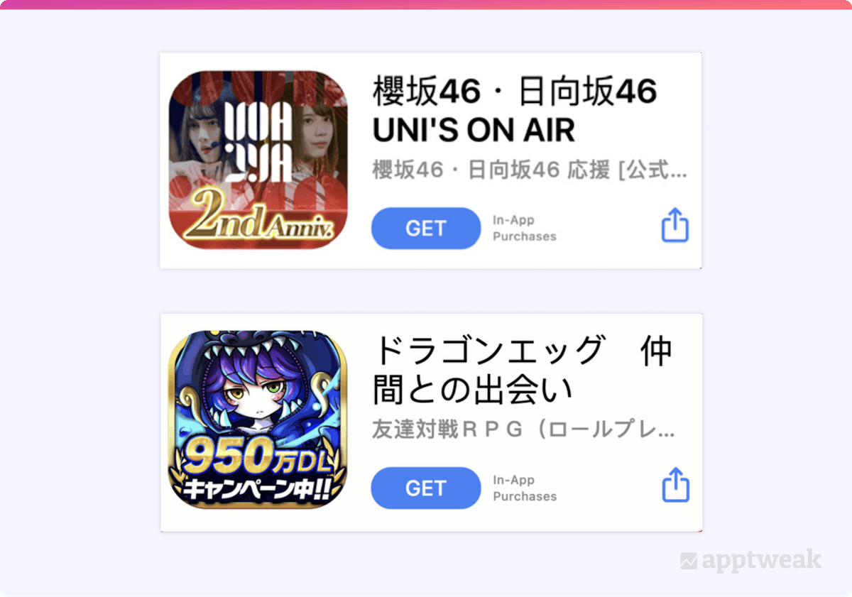
Kawaii, meaning “cuteness,” plays a big role in Japanese culture and makes cute mascots or visual elements very appealing. In Japan, developers use icons to mark special occasions, milestones, and big updates with overlaid text on top of the design.
The text is bolder, more aggressive, and more colorful than in the West. Mixing colors and textures is also an important part of Japanese culture.
 Different ways in which games use icons to mark special occasions on the Japanese App Store.
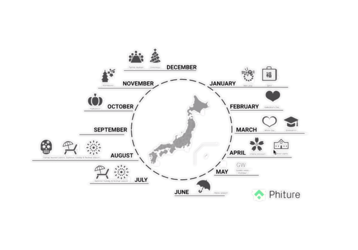
Understand seasonal events in Japan and use them to your advantage by localizing your app icon.
Make your app more relevant to Japanese users by updating your app icon for events like Cherry Blossoms, Golden Week, and White Day. Phiture provides a list of these events to guide your entry into the Japanese market.
 A list of the seasonal events in Japan for apps and games looking to localize in the Japanese app market. Source: Phiture
2. Screenshots
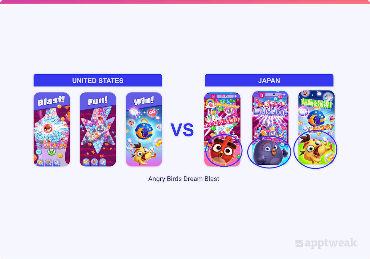
Screenshots in the Japanese app stores tend to have more text and to be more crowded than in the West. Native publishers use lots of small elements in their app store screenshots, adding special effects and emotional captures all over the image.
For games, add anime or manga characters in the foreground to highlight them. Japanese users are fond of comic/anime style elements.
 Angry Birds Dream Blast has magnified the cute characters in its screenshots in the Japanese App Store.
Also, the choice of colors for screenshots is very specific. Apps, especially games, use the RGB color scheme. RBG consists of bright colors used to make the visual exciting. This is very popular, as Japanese users are fond of the complicated and crowded visuals, which is different from the Western’s minimalistic approach in design.
Bonus tips to localize your app for Japan
1. Font styles & colors
Selecting the right font style is crucial for conveying your message in Japanese. Different fonts can signify different purposes. The three most commonly used types are Gothic, mincho-styled, and handwritten or textured fonts
- Use Gothic font for normal expressions with thicker font for emphasis.
- Highlight fantasy, historical, or surreal context with mincho-styled font and also to reflect emotion.
- People typically use handwritten or textured fonts for short, sharp sentences or exclamations and to depict confusing situations. They don’t work well with long sentences
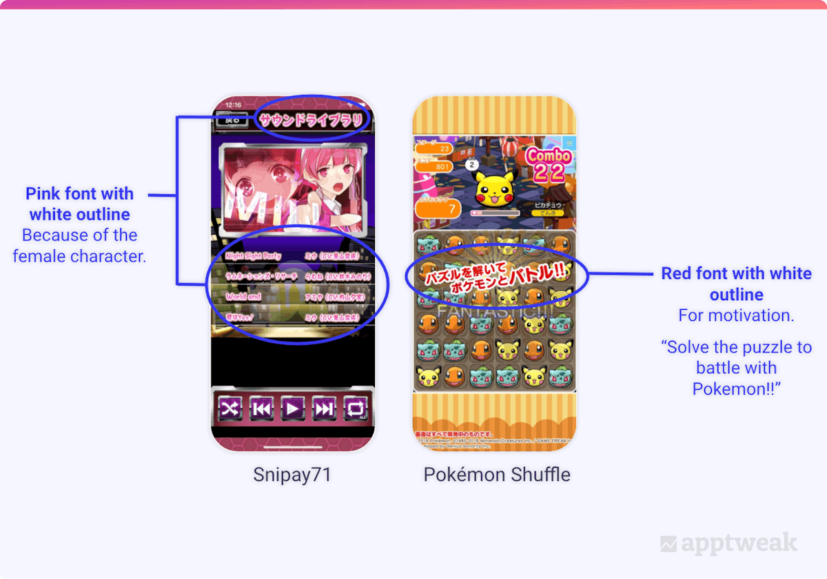
Choosing the right font color is crucial because different colors depend on the message, the interlocutor, and the emotions conveyed. For example, use pink fonts when communicating with female interlocutors. Use red to express motivation and purple to convey mystery. You can also use white or black outline to emphasize on sentences.
In general, Japanese tend to use bright colors with manga and anime elements, especially yellow and orange.
 Choose font style and color wisely when designing your app screenshots for Japan.
2. Speech bubbles
The text/speech bubbles selection is effective, as different drawing styles express different things.
.png?auto=format,compress&q=75&w=1200) Text bubbles in Japanese app screenshots.
Text bubbles in Japanese app screenshots.
3. Add social proof
Social proofing happens to be very effective in Japan. Japanese users are positively influenced by social proofing arguments when deciding whether to download an app/game. So, social proofing should be something to strongly consider when designing your screenshots and when writing the 3 first lines of your long description.
.png?auto=format,compress&q=75&w=1200) Including social proofs is desirable when localizing your app screenshots for Japan.
Including social proofs is desirable when localizing your app screenshots for Japan.
4. Avoid sensitive topics
Some topics are negatively received in Japanese culture, especially in games. It is recommended to avoid promoting any religion, images of tobacco products and drugs. Also, when using cultural elements, it is important to make sure that these are Japanese and not Chinese, as Japanese users won’t tolerate the mix-up. Finally, when it comes to violence in games, it is better to remove or tone down the blood. The player should not take the role of a killer, and children/innocents should not be killed.
TLDR
Japan is the go-to market for apps and games that are looking to expand worldwide. To successfully localize your app in the Japanese market, here are some valuable tips for you to keep in mind:
- It is advisable to put a space between each keyword for the title/ subtitle, as in English, to lower the risk of rejection due to keyword stuffing.
- For the keyword field, it is important to separate each keyword by a comma to maximize exposure.
- Japanese have a preference for manga and anime characters, so include cute mascots and Asian elements in your creatives to make your app/game visually appealing.
- Keep in mind the font style and color choices in Japanese depending on the purpose of your message.
- Consider social proofing when designing your screenshots for the Japan app market.


 Lina Danilchik

 Elizabeth Devine

 Ian Pernia