Google Play Store optimization: the ultimate guide for Android apps
Last month alone, 34,000 new apps were released on the Play Store. Standing out in the Play Store takes more than just a great product. This guide breaks down Play Store optimization: from keyword strategy and creative assets to A/B testing and localization. Get the top tips to improve visibility, increase installs, and grow sustainably.
Key takeaways
- Google Play Store optimization is essential to improve app visibility, conversions, and long-term performance.
- Google’s algorithm ranks apps based on keyword relevance, user behavior, ratings, retention, and update frequency.
- Use the app title strategically for keyword indexation, while focusing the short description on conversion and keeping the long description structured and readable.
- Strong visuals—icon, screenshots, and video—play a major role in capturing attention and boosting conversion rates.
- Reviews and ratings directly influence visibility and should be actively managed with smart in-app prompts and timely responses.
- Retention metrics like session length, usage frequency, and uninstall rate help Google assess app quality and relevance.
- Localization goes beyond translation. Adapting creatives and in-app content for each market can significantly improve performance.
- A/B testing is most effective when based on a clear, behavior-driven hypothesis, but may not be worth it for low-traffic apps.
- Success in ASO requires ongoing iteration and performance tracking using data from the Google Play Console, MMPs, and ASO platforms like AppTweak.
- Looking into 2026, Google is moving toward theme-based keyword understanding, video-rich listings, and increased emphasis on fresh, event-driven content.
What is Google Play Store optimization?
The Google Play Store has come a long way since its initial launch in September 2008. Over the years, Google has continually updated it to enhance user experience and, most notably, improve app and game discoverability. To achieve better discoverability, Google leverages a concept similar to Search Engine Optimization (SEO), commonly associated with Google’s web search. However, when applied to the app stores, this approach is known as App Store Optimization (ASO), and is noticeably different as detailed in our blog ASO vs. SEO. For Google Play specifically, we talk about Google Play app optimization.
When someone searches for an app on the Play Store, how does Google decide what to show first? Google’s algorithm assesses various elements within an app’s store listing to determine if your app matches a user’s intent. The more relevant your app or game store listing is, the higher it will rank in search results, ultimately driving more visibility and potential downloads.
Therefore, keyword relevance forms the foundation of Google Play Store optimization. Google has progressively expanded its tool offerings to boost discoverability further, introducing features like Promotional Content, Store Listing Experiments, and Pre-registration. These tools provide app marketers greater control and flexibility, helping to maximize their app or game’s reach and download potential.
The core objectives of Google Play Store optimization are consistently defined:
- Increase the volume of downloads generated by your app.
- Boost visibility across the various sections of Google Play, including Search, Explore, Ads, and Referrals.
- Optimize conversion rates on your store listing by strategically using creative assets.
- Enhance and complement your paid user acquisition strategies.
Explore 2025 app store trends & benchmarks for the Play Store!
How does the Google Play Store ranking algorithm work?
While Google Play Store optimization might initially appear daunting, knowing which elements in your app store listing influence Google’s algorithm can significantly simplify your optimization efforts. By recognizing these elements, you can effectively act to maximize your app’s visibility and downloads on Google Play.
Below, we’ve outlined the key factors for improving your organic presence on the Google Play:
1. App title, short description, and long description
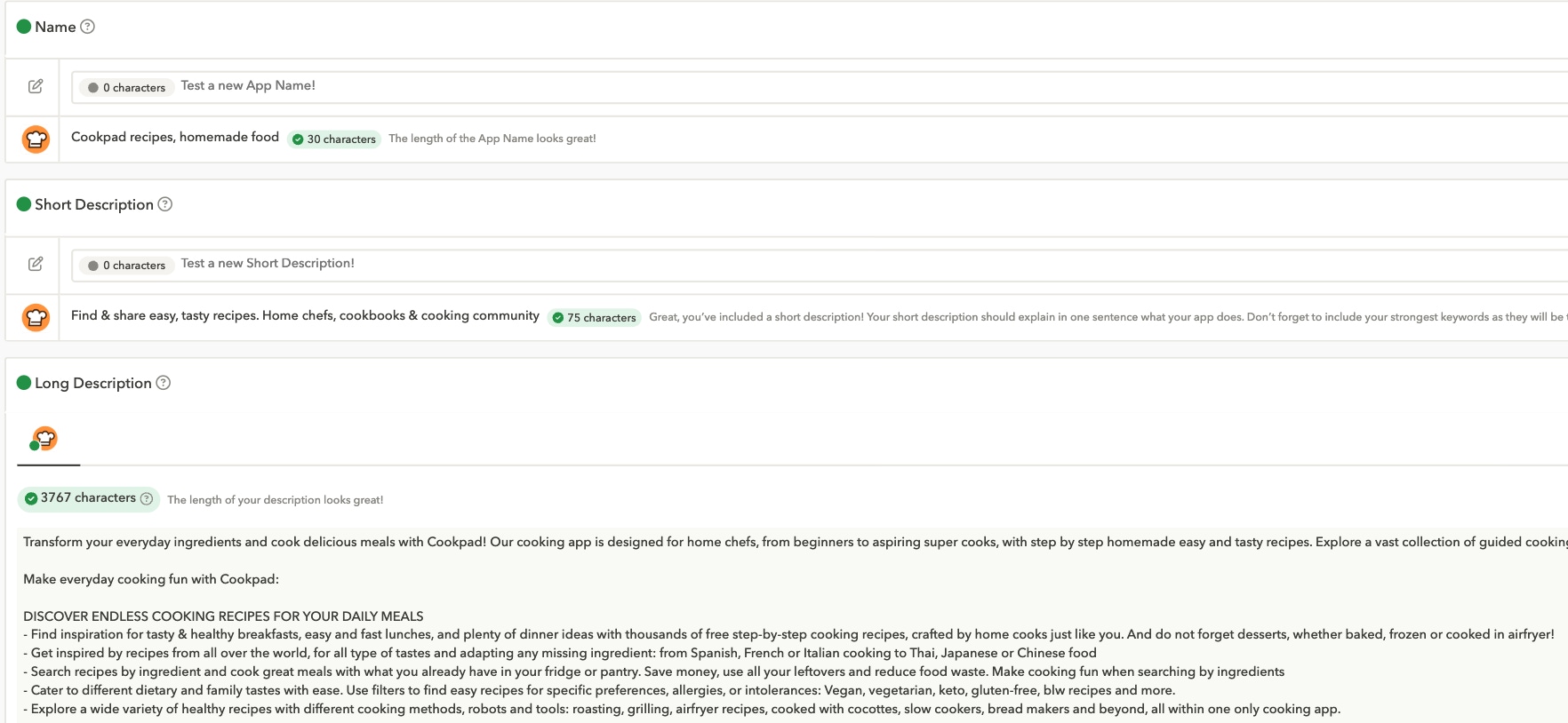
Your app’s textual metadata (title, short, and long descriptions) helps Google match your store listing to relevant keywords searched by users. Consider this scenario: If a store visitor searches for “cooking recipes,” having this exact keyword phrase prominently included in your descriptions strongly signals your app’s relevance to Google’s algorithm.
Below you can see the CookPad recipes, homemade food (yes, that’s the entire app name) incorporating the term “cooking recipes” throughout its metadata. The app currently ranks second for this term on Google Play in the U.S.

2. User behavior
Effective Google Play Store optimization is about shaping how users interact with your app. Your goal should be to drive store visitors to your store listing, encourage them to hit the “Install” button, and keep them engaged over time.
Google observes a crucial feedback loop here. If users search for a keyword, view your listing, install the app, and continue using it over 30 days, Google’s algorithm interprets this behavior as a strong indicator of your app’s relevance. In turn, this boosts your ranking and overall discoverability.
If users install your app but uninstall it shortly afterward because they feel it didn’t meet their expectations, this sends a negative signal to Google’s algorithm, so make sure to convey the right message.
3. Ratings and reviews
Ratings and reviews significantly influence conversion rates on your store listing. Think of your own online shopping habits—do you buy products without first checking reviews? Google similarly highlights ratings and reviews prominently in store listings.
Lower ratings or negative reviews reduce your conversion rate, directly impacting your app’s visibility. Importantly, apps rated below three stars lose visibility entirely in the Explore section of Google Play. For a deeper dive, check out our article on why and how to analyze app store reviews.
4. Android vitals
Users avoid apps that crash, freeze, or perform poorly. Google acknowledges this user behavior by penalizing technically problematic apps, thus diminishing their discoverability.
Fortunately, Google provides detailed insights through the Android Vitals section in the Google Play Console, helping developers identify and fix technical issues to improve overall app performance.
5. Freshness and regular updates
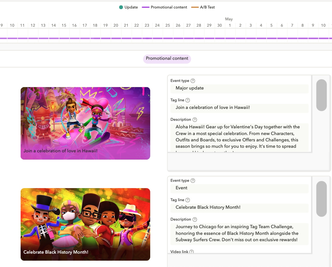
Google prefers actively maintained and regularly updated apps, as these are easier to market and remain relevant to users. Features like Promotional Content—which showcases in-app events—are designed by Google to incentivize app developers to frequently update their apps and store listings.
Regular updates signal to Google’s algorithm that your app is fresh and relevant, significantly boosting your Google Play Store ASO, and ultimately, your app’s discoverability.
See other apps’ promotional content in AppTweak for inspiration on how to capitalize on seasonal events.

Play Store keyword optimization: titles, subtitles and descriptions
Getting your titles, subtitles, and descriptions aligned with the right keywords is the base of Google Play optimization.
App title best practices
Your app title carries the most weight with Google’s algorithm, making any keyword included here especially influential. While you shouldn’t compromise your brand identity—if your app is Netflix, keep “Netflix” prominent—you should utilize the 30-character limit strategically by placing highly relevant, high-search-volume keywords directly after your brand name.
App short description optimization
Think of the short description as the storefront of your app. It quickly shows visitors what your app does, the problems it solves, and why they should care. While the short description is indexed by Google, its primary goal is boosting conversion rates. Therefore, focus on clearly conveying your app’s value rather than prioritizing keyword targeting here.
Long description strategy
Few store visitors actually read your app’s long description, and if they do, they’re likely to skim only the first few lines. Nevertheless, a strong long description is crucial, as it helps convert these rare, highly-engaged visitors.
Additionally, Google indexes your long description and favors content that’s naturally structured and easily scanned. For indexing purposes, strategically repeating your main keywords a few times within the text will strengthen your relevance signal to Google’s algorithm.
Visual optimization: Icons, screenshots, and promo videos
Your app’s creative elements matter a great deal when it comes to Google Play Store ASO. Here are the insights you need to know.
App icon best practices
Your app icon is the most crucial visual element of your store listing, it’s the very first thing visitors notice when they discover your app on Google Play. Therefore, creating an impactful and effective icon is essential.
Tips to design a high-performing icon:
- Keep it simple: Clean, bold designs are easier to recognize—especially on smaller screens.
- Maintain brand consistency: Use your core colors, fonts, and visual style to reinforce familiarity.
- Make it stand out: In saturated categories, uniqueness helps your app break through the visual noise.
App screenshot best practices
Screenshots are your strongest asset to quickly show interested store visitors what your app offers and why it matters. In just a few seconds, your screenshots need to communicate your core value proposition and spark interest. Since visitors rarely scroll past the third screenshot, highlight your key features upfront.
Enhance impact by ensuring screenshots and captions complement each other. Also, research category best practices. For example, finance apps emphasize social proof, games often showcase dynamic graphics, while shopping apps highlight ongoing deals. For more examples, check out our blog on how to optimize your app screenshots.
Promo video tips
Creating a video takes more time than other creative assets, but it can be a powerful way to showcase the user experience and highlight your app’s unique selling points. Before investing in one, check whether videos are commonly used in your category and among competitors.
If you choose to create a video, keep it short: 30 seconds is ideal, but the first 15 seconds are the most impactful. Get straight to the point. Keep your video simple yet informative, and make sure that it aligns with your brand’s visual style.
How to boost Google Play installs through ratings, reviews and user engagement?
Ratings, reviews, and user engagement aren’t just nice-to-haves, they’re some of the strongest trust and ranking signals in Google Play. Mastering these areas can dramatically boost your app’s visibility and downloads.
How reviews and ratings influence Google Play Store ASO
There are two key things to know about reviews and ratings.
1. Most store visitors will check them before deciding to download your app.
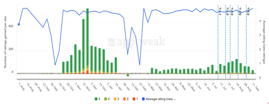
- Google reduces your app’s visibility if its rating drops below 3 stars.This is why it’s crucial to reply to reviews, and to prompt satisfied users to leave a review at the right moment. A well-timed in-app prompt can help you collect more positive reviews from your happiest users. On the Google Play, even a 4.5-star rating may not be enough, which is why you must consistently work toward improve your ratingTo go a step further, tools like AppTweak’s App Reviews Manager help you monitor and analyze user reviews over time. You can quickly spot recurring issues, track rating trends, and surface opportunities to improve sentiment—all in one place. This makes it easier to take action and boost your app’s reputation in the eyes of both users and Google’s algorithm.

In fact, The North Face used AppTweak’s review feature to track key pain points and spot opportunities for improvement. By analyzing reviews and pairing them with feature updates, they increased their average Play Store rating from 3.5 to 4.6—a 22.25% increase—in just a few months, boosting both credibility and visibility.
How to get more 5-star reviews on Google Play
To improve the ratings and reviews your app receives, the key is to be proactive rather than reactive. While replying to reviews is important, it often comes too late, after the user has already made up their mind about your app.
It’s well known that unhappy users are more likely to leave reviews unprompted, so take control by integrating a smart in-app prompt at the right moment in the user journey. You can for instance first add a custom prompt to gauge user satisfaction and ensure only happy users are nudged to leave a review.
Engagement metrics that affect Play Store rankings
Google Play doesn’t just care about downloads, it also aims to surface apps that retain users over time. Retention is a strong signal of quality, and the algorithm takes it into account when deciding which apps to highlight on the Play Store.
To ensure your ASO efforts are on point, monitor key retention metrics like Average Session Length, Frequency of Use (daily, weekly, or monthly opens), and Uninstall Rate. These indicators help Google determine whether your app delivers lasting value and deserves more visibility.
How to localize your Google Play Store listing for global reach?
Localizing your store listing helps align your app with the cultural expectations of your target market, making it more relevant, discoverable and appealing to local users.
At a minimum, this means translating all textual elements. But if you’re serious about entering a new region, it’s worth investing time and budget into deeper localization. This includes adapting your creatives, ensuring the app itself is available in the local language, and properly translating all in-app content.
Here’s a simple process to guide your localization strategy.
- Identify target regions
Start by evaluating which markets already show promise. Look at existing downloads, revenue, and even search volume for your app’s brand name in different countries to assess awareness and momentum.
- Research cultural and visual trends
Explore how competitors in your category present themselves locally. AppTweak’s ASO Creatives Explorer can help you scan local store listings, uncover creative trends, and spot visual or cultural cues you can adapt in your own screenshots.
- Adapt and validate creatives
Move into the design phase by creating wireframes that reflect your research. Once finalized, have a native speaker review your visuals and captions to ensure nothing gets lost in translation and everything feels culturally appropriate.
- Track performance by region
To measure the success of your localized ASO strategy, track performance across key metrics for each market, such as top-performing keywords, conversion rate, average rating, retention, and uninstall rate. This helps you identify which regions are responding best, and where further optimization is needed.
Here’s an example of how your regional performance dashboard might look for a planning app.
| Region | Top keywords | Conversion rate | Average rating | Retention (Day 7) | Uninstall rate |
|---|---|---|---|---|---|
| United States | productivity, planner app | 22.60% | 4.4 | 32% | 8.20% |
| Brazil | tarefas, agenda, app gratis | 27.30% | 4.6 | 35% | 6.70% |
| Germany | aufgaben, zeiterfassung | 19.80% | 4.2 | 30% | 9.10% |
| Japan | アプリ, スケジュール | 25.40% | 4.5 | 38% | 7.30% |
How to run experiments with A/B testing on Google Play?
When running Store Listing Experiments on Google Play, it’s important to start with a clear hypothesis that focuses on one specific change you think could improve conversions.
For example, you might guess that showcasing a key value prop in your first screenshot will lead to more installs. Make sure you can justify why you think your hypothesis would improve your app’s conversion rate.
The idea is to test one variable at a time, like the wording of your short description or the layout of your visuals, so you can actually understand what’s making a difference. A focused, behavior-based hypothesis helps keep your test on track and makes it easier to draw clear, actionable conclusions from the results. Learn more in our blog A/B testing in ASO.
Common mistakes to avoid in Play Store optimization
Avoid these pitfalls in your Play Store optimization to ensure success.
1. Keyword stuffing
Just like in search engine optimization, keyword stuffing for the sake of indexation can backfire. While repeating a keyword a few times can help boost its relevance, disrupting the natural flow and readability of your text will ultimately hurt your app’s performance.
Google’s algorithm is smart enough to understand and evaluate your content in context, so clarity and coherence matter just as much as keyword usage.
2. Relying on A/B testing when traffic is too low
Running endless A/B tests due to low traffic is a common issue, especially for smaller apps. Many clients tell us they wait months for results that never reach significance.
In such cases, we strongly recommend skipping the A/B test and publishing the update directly. You can then assess its impact after two weeks and decide whether to keep the changes or revert to the previous version. It’s a far more time-efficient approach when traffic levels don’t justify a full experiment.
3. Overlooking Promotional Content
Not having a Promotional Content strategy is a missed opportunity for apps, especially games. Google now actively boosts the discoverability of titles that use Promotional Content to highlight time-limited in-app events. It’s highly recommended to run one piece of Promotional Content every seven7 days, each lasting seven days, to maintain visibility and engagement.
Measuring the success of your Play Store optimization strategy
Measuring the success of your ASO efforts on Google Play mainly relies on analyzing data from the Google Play Console and, when relevant, your mobile measurement partner (MMP). The metrics you focus on will depend on the elements you’ve optimized.
For example, if you’ve updated your store listing’s textual metadata to improve keyword visibility, you’ll want to monitor Store Listing Acquisitions from Search and Explore to gauge the impact.
AppTweak provides a suite of tools that can also help Google Play app optimization. You can track your app’s keyword visibility over time, allowing you to quickly spot and adjust anything that isn’t delivering the results you expected.
When it comes to creatives, the key metric to watch is your conversion rate, as that’s where changes to visuals typically have the most impact.
What’s next for Google Play Store optimization?
ASO on Google Play is expected to shift in a few key ways. First, keyword optimization will remain crucial, but Google’s algorithm is moving toward understanding broader keyword themes rather than isolated terms, meaning app marketers will need to focus on context and clusters rather than stuffing keywords.
Second, video content is gaining traction: Google now lets developers link their YouTube channels to their store listings, offering more dynamic ways to engage users and boost conversion.
Lastly, Promotional Content continues to grow in importance, especially for games, as Google increasingly rewards apps that regularly update their listings with time-sensitive in-app events. These updates reflect Google’s push for richer, more contextual user experiences in the Play Store.
Conclusion for Google Play app optimization
Google Play Store optimization has evolved far beyond simply adding keywords or updating an icon: it now requires a holistic, data-informed approach that considers every stage of the user journey, from visibility in search to in-app engagement and long-term retention. Whether you’re fine-tuning your metadata, designing high-converting visuals, encouraging better reviews, or localizing for growth markets, your ASO efforts need to reflect both user expectations and Google’s increasingly sophisticated algorithm.
The key takeaway? Don’t treat ASO as a one-off checklist, but as an ongoing process, one that blends experimentation, smart analysis, and strategic updates to stay competitive in a dynamic store environment. In the near future, the apps that win will be the ones that combine technical performance, strong branding, and meaningful creative updates to meet both algorithmic and user needs.
If you’d like to see how AppTweak helps your app visibility on Google Play, explore our platform for free.
FAQs
Here we answer your top FAQs about Google Play app optimization.
What is ASO for Google Play?
ASO for Google Play is the process of optimizing your store listing to improve visibility, conversion, and overall app performance on the Play Store.
How do I improve my app’s ranking in the Play Store?
Focus on keyword relevance, strong creatives, user retention, high ratings, and regular updates to signal quality and relevance to Google’s algorithm.
How often should I update my android app listing?
There’s no set rule for how often to update your app listing, but doing so regularly helps signal freshness to Google: just make sure each update is purposeful and not done for the sake of change.
Do reviews and ratings affect Google Play ASO?
Yes, Google highlights ratings and reviews prominently for store visitors to see, and apps rated below 3 stars lose visibility in key sections like Explore.
How long does Google Play Store optimization take to show results?
You can usually evaluate the impact of an update after about two weeks. However, for keyword-related changes, it’s worth waiting an extra one to two weeks to get a clearer picture.


 Lina Danilchik

 Alex Moulder

 Simon Thillay