10 Tips for Designing a Mobile App Icon
App icons play a very important role in the click-through rate (CTR) of a mobile application. Just like in real life, first impressions matter a lot on the app stores. With over 2 million apps on the App Store and Google Play, it is crucial for apps to have an optimized icon and stand out from competitors.
The goal behind an app icon is to immediately grab the user’s attention and drive them to download the app. It is not only important to design an app icon that is unique but also to depict the app’s main functionalities. Have a look at these 10 expert tips and best practices to design an optimized app icon.
Follow these comprehensive guidelines to optimize your entire app product page on iOS and Android
Tip #1: Keep your app icon simple
People seek the easiest way to get what they want. Therefore, your app icons should be clear and simple to understand. An app icon that shows multiple features or a lot of details can appear too cluttered. So if your app icon is too complicated, it may confuse users and fail to communicate what your app is about.
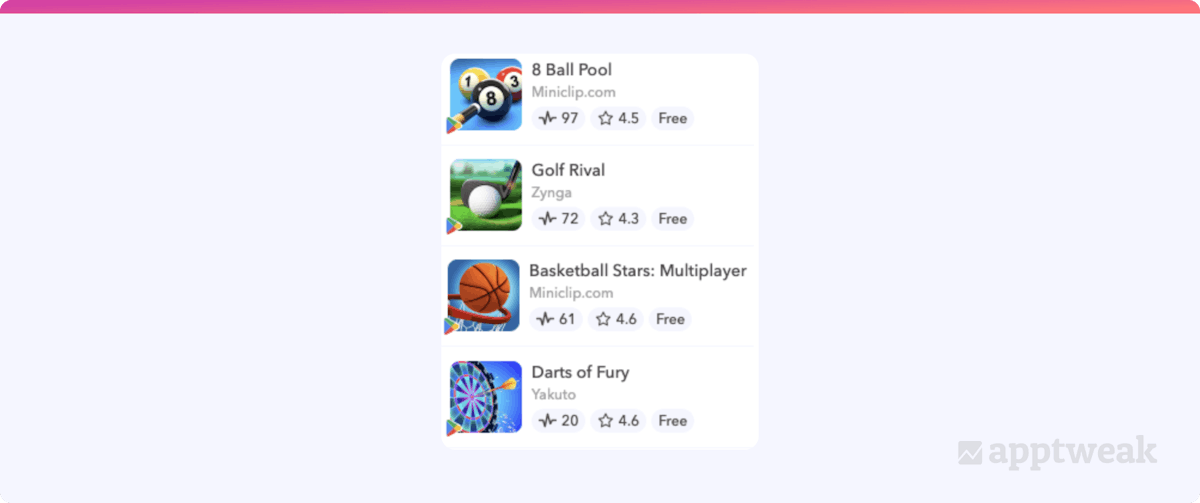
The following example shows the top free sports games on Google Play that stand out with simple designs, focusing on one object only.

Tip #2: Your app icon should communicate your app’s purpose
While it’s true that you should not clutter your icon with too many details, make sure your app icon is concise and conveys your app’s main functionality. You don’t want to create an abstract app icon that will leave users unable to grasp what your app is about. Therefore, think about your brand and the services you offer, your unique value proposition, your app’s use, and its main benefits. Design your app icon keeping in mind what you are offering to your end users.

In the image above, live search results are shown for “plant identifier.” Apps like PictureThis and PlantID convey to the user a clear app functionality – both show a plant within an image outline in their icons while keeping the designs simple. Though Seek and PlantSnap have used creative elements in their icons to display a purpose related to tech and plants, the icons aren’t clear enough for the purpose to be relayed on their own. Finally, PlantIn, Planty, and PlantNet all focus on plant imagery but miss out on the easy identification element in their app icons.
ASO with AppTweak Course & Certification
Authenticate your ASO and AppTweak knowledge with a certification!
Get certifiedTip #3: Choose the right colors for your app icon
To design a good app icon, make sure that the colors align with your brand. Take the time to think about how to make your icon stand out in the search results:
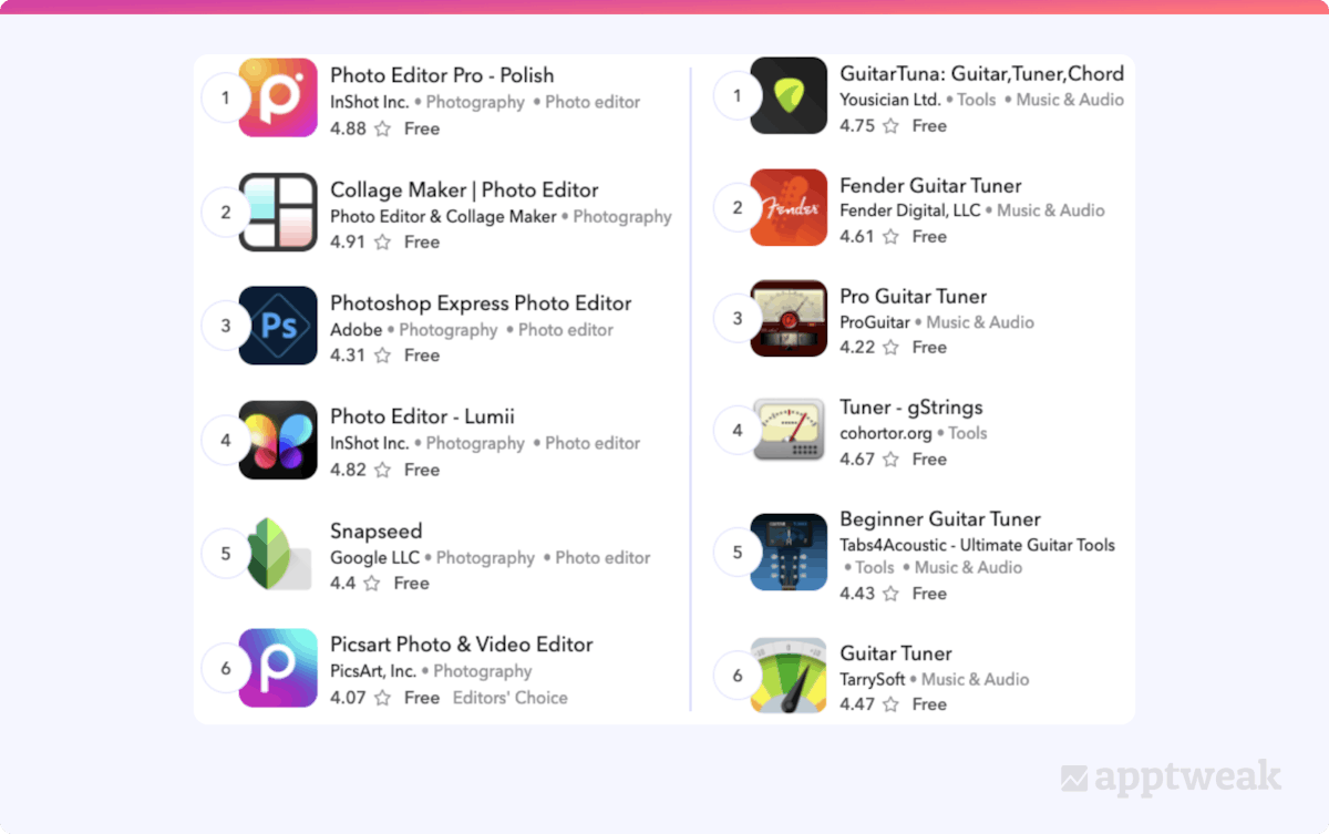
Bright colors can help an app attract the user’s attention. Don’t use too many colors either – one or two main colors should be enough. Simple app icons drive much more conversion than complex ones. In this example, we see many apps have used bright colors to stand out amongst competitors. The most eye-catching icons include Photo Editor Pro, Piscart Photo & Video Editor, GuitarTuna, Fender, and Guitar Tuner.

Another way to choose the colors for your app icon is to reflect on your brand colors. For example, Headspace has a very simple app icon, which consists of its logo on a white background. The unembellished icon depicts the simplicity of the app’s UX (user experience) and lets users know what to expect after downloading the app.

When designing your app’s icon, keep in mind that they should look as good in dark mode as in light mode. For example, you should use contrasting colors in both modes. Typically, you want your app icon to look polished on both white and black backgrounds. Another great tip for Android is to use a transparent background in the app icon (as exemplified by Spotify below) so that it adapts to the user’s preferred mode. AppTweak’s App Page Preview (App Store) or Store Listing Preview (Google Play) allows you to upload several different icons to test which version looks best in both modes.

Discover which colors are used the most by top apps in different categories
Tip #4: Avoid using too much text in your app icon
It is necessary for an app icon to be understood by itself. The age-old proverb “a picture is worth a thousand words” goes hand in hand when creating an icon for your app. Icons are usually better perceived when they do not contain any words. They tend to generate more clicks and are less confusing.
Keep in mind that apps are displayed relatively smaller on mobile devices. Using loads of text causes a lot of clutter, and the user may not understand what the app is about. Adding text can also cause localization problems if you decide to launch your app in a new country.
For example, casino games tend to use many different color combinations and add text to their icons. While casinos are designed to engage all your senses, this flashy design looks rather cluttered on the app store and does not make an app stand out amongst competitors in the search results.
If you are adding text, ensure that the font is easy to read and doesn’t crowd the app icon. Also, make sure not to use promotional copy in your app icon that suggests store performance or endorses deals.

Explore the 7 app store creative trends predominant in 2022
Tip #5: Use logos for your app icon only in strong branding
Developers sometimes wonder if using their brand logo might be a good idea for their app icon. This can create stronger brand loyalty and a stronger image. Ideally, this is more effective when your brand is already quite popular and has a more prominent visual identity (e.g. Nike, Snapchat, TikTok, Spotify, or Tinder).
Adding a logo to your app icon is not recommended if that logo is not commonly known. You want your app to be quickly understood by your audience. If your logo is not recognized, your app’s purpose will not quickly be depicted to users.
For example, the apps displayed in the top charts of the Food and Drink category on the App Store are established brands with well-known names or logos. The use of logos in their icons helps users quickly recognize the apps in the search results. On the other hand, utility apps have less brand recognition on the app stores. Therefore, a simple icon that explains what the app is about would be more effective than the brand name or logo.
Again, it is important to remember here that app stores do not accept apps using promotional content or misleading graphics in their logo.

Tip #6: Update your app icon for seasonality
It is crucial to update your app icon from time to time. This can be extra appealing to users if you update your app icon for special holidays such as Halloween, Christmas, and the New Year. You want your users to know that you are constantly implementing new features and engaging with the audience. Customers appreciate it when companies take the time and effort to publish relevant updates.
Icon updates don’t necessarily need to be totally redesigned. For example, let’s look at the example of Trivia Crack 2. We noticed that the icon remains similar and familiar, but stands out with a seasonal touch.

Tip #7: Localize your app icon across markets
When optimizing your app icon to stand out amongst competitors, consider doing so across all markets where your app is available. When users see your app in the stores and find that the app icon fits their cultural design preferences, they may feel more naturally connected to your app. Also, if your competitors are not localizing their app icons across markets, doing so will make your app stand out even more.
In 2021, mobile game developer Supersolid wanted to optimize its app icon for the Brazilian market. Following AppTweak’s actionable insights, they began A/B testing creative variables. This began with a market analysis of the locale by looking at several variables to identify the best strategic plan of action. Using these insights, they created alternatives of the Home Street icon to test variations of the character, her outfit, and the background. Following the tests, Supersolid implemented the icon shown below (on the right) for its Home Street game in Brazil, as this variable performed best there.

Tip #8: Differentiate your app icon from competitors
Before creating your app icon, you might want to check what your competitors are doing. You want to think from the perspective of a customer – why your app over competitors’? By monitoring your competitors, you can find inspiration on how to differentiate or improve your app icon. Your goal is to stand out from the crowd by highlighting a certain value to your icon that makes it unique.
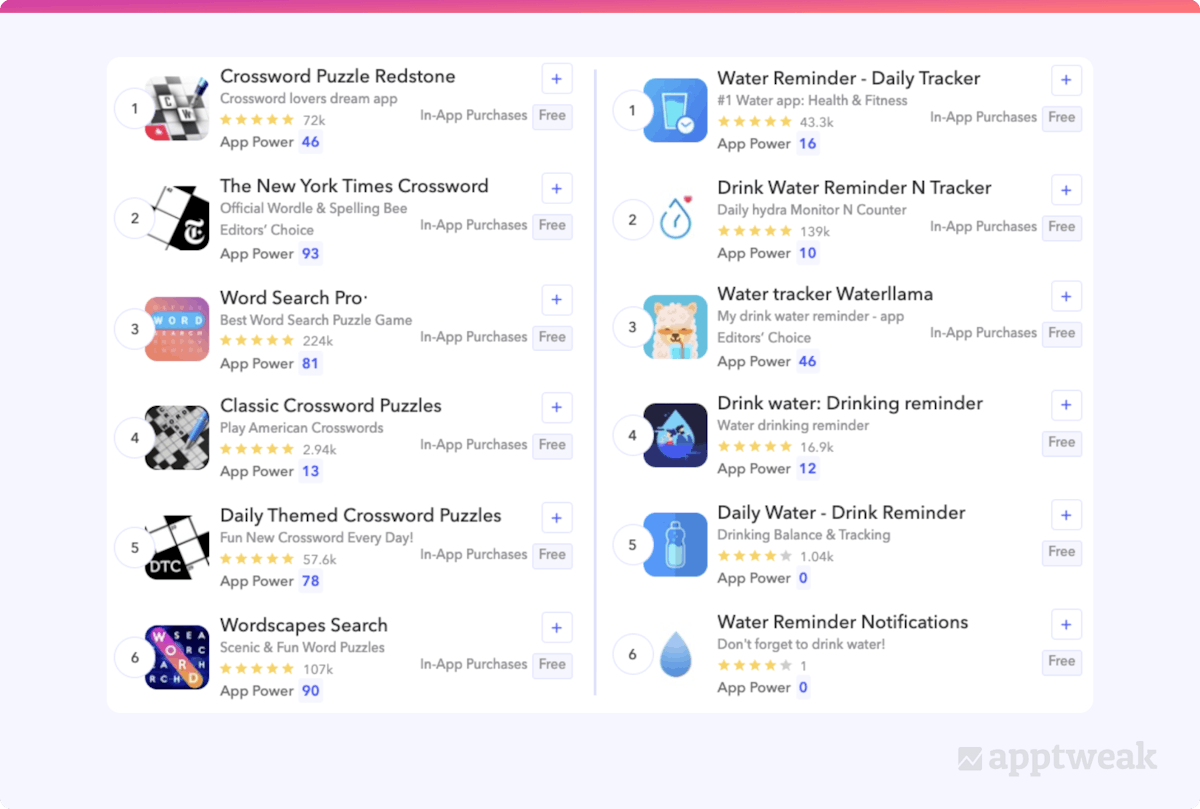
In the following example, we see how apps with similar purposes and lesser-known logos still demonstrate their purpose while differentiating themselves from competitors. When searching for “crossword puzzles” and “hydration reminder,” we can see how apps are able to set themselves apart while still portraying their purpose clearly.

Understand app store icon trends in each category & country with AppTweak
Tip #9: Learn from your competitors and implement A/B tests
With AppTweak, you can spy on your competitors’ A/B tests and learn what works for them. With our Timeline feature, we automatically identify when an app is running an A/B test. You can then dig deeper and understand which versions they are testing against.
To further illustrate, we did a quick study to see how Playrix’s Gardenscapes has utilized A/B testing for their icon. Throughout early 2022, Gardenscapes tested a few app icon options and in late March, the app implemented the most effective icon.

When optimizing your own app icon in order to identify which version is most likely to be successful, A/B and A/B/B tests can be very useful. To run an A/B/B test, you can implement tests for an alternate icon, as well as a variant that is your current icon. As an example, let’s dive a bit deeper into Playrix’s app icon testing and look at Homescapes.

Here, we see that Homescapes tested an icon variant of a mother holding her baby in the snow with a sorrowful expression. Alongside this version, Homescapes also included a variant with their current app icon. This ensures the most accurate data when determining the success or failure of a tested app icon.
Learn more about the A/B/B testing method on Google Play
Tip #10: Follow app icon guidelines set by the app stores
While designing an app icon for the App Store or Google Play, adhere to the following guidelines set by each store.
On the App Store:
- Create an app icon design that works well on multiple platforms when applicable so that it is clearly implemented on each. For example: for macOS and watchOS apps.
- Prioritize graphical images over photos and avoid screenshots or replicating UI components in your icon. It is better to create graphics specifically for your app icon.
- Design your icon as a square, full-bleed image.
- Consider offering alternate app icons, but ensure the variations are still loyal to your brand image. For example: A sports app offering alternate app icons for different teams, or a game offering alternate icons to display various characters.
On Google Play:
- Google recently updated its icon system to follow the rounded-corner square, similar to iOS, and will also include drop shadows. Due to this, your original asset should not have rounded corners or a drop shadow and should be uploaded as a full-bleed icon.

- Google prohibits including keywords that suggest store performance in the app icon.
- It is also strongly recommended not to use graphical elements in the app icon that may mislead users about your app.
- Google also does not recommend including deal advertisements in the app icon (e.g. discounts) or using this space to promote your inclusion in a Google Play program.
Designing an app icon can be difficult, but we hope that these tips help you move forward with confidence! Don’t be afraid to step outside of your comfort zone and be creative with producing an app icon that truly resonates with your brand. We can’t wait to see the icons you create!


 Sukanya Sur

 Justin Duckers


 Yuliya Tsimokhava

 Emily Sugrue