
10 Tips to Optimize Your App Paywall
In the competitive mobile app world, success and profitability require a strategic approach. Optimizing your paywalls is crucial for sustainable revenue generation and growth. In this article, we share 10 invaluable gems to help you maximize your app’s revenue. From understanding your audience to highlighting app value, we cover essential aspects for a successful paywall implementation.
This is a guest post written by Purchasely.
1. Turn paywall screens into a sensor
When it comes to optimizing your app for better monetization, understanding your audience should be a top priority. Fortunately, there are plenty of strategies to achieve this. Time-tested methods like user surveys, feedback collection, data tracking, and competitor analysis remain as valuable as ever.
What’s the first step in optimizing your paywall strategy? A paradigm shift.
Consider your paywall screens as dynamic sensors offering valuable user insights. offering valuable insights. To capture your audience’s preferences, use elements like touch points, pricing, design, and messaging. By closely tracking conversion rates across these variations, you can identify what resonates with your target audience.
By using these insights to iterate your paywall dynamically, you can intelligently tailor your paywall engagement for each user. This ensures maximum effectiveness and drives successful conversions.
2. Emphasize the value of your app and the subscription
Many apps prioritize showcasing flashy features, often leaving users wondering where the true value lies. To optimize your app’s paywall and drive conversions, it’s crucial to go beyond mere feature display and highlight the app’s true value.
To help you navigate through numerous options and effectively emphasize your app’s value, we’ve selected tactics applicable to various app categories:
- Empathy-driven messaging: Show genuine empathy towards users’ pain points and contexts in your paywall messages. It’s about positioning your app as the solution that truly understands and caters to their needs.
- Progress/habit tracking and milestones: To keep users engaged and motivated, consider using their activity history. Track their progress, achievements, and milestones, and then display this information on your paywalls. This way, you can highlight their accomplishments and the value they’ve gained from your app.
- Consistent and regular engagement: Interact with users through customized notifications, reminders, and various touchpoints along their user journey to maintain regular engagement and stay on their radar.
- Social proof: Enhance the perceived value of your app by incorporating social proof elements. Add user testimonials and ratings or reviews that vividly illustrate how your app has transformed lives.
- Foster the sense of belonging: Increase the sense of shared identity and purpose. Encourage social sharing, share evolving user counts, and offer cohort/community-specific promotions.
3. Use the power of aesthetics
First impressions are incredibly important, particularly when it comes to paywalls. As a matter of fact, 68% of users will close your paywall within less than 10 seconds (Jeff Grang, CPO and co-founder of Purchasely). Similar to how dressing well can leave a positive impression, the visual aesthetics of your app’s paywall have a profound effect on how users perceive and engage with your app. Here’s why you should pay attention while designing your paywalls:
- The halo effect
Aesthetic appreciation, known as the “halo effect,” leads to a positive attitude, fostering loyalty to the brand. This is evident in Apple enthusiasts, who appreciate the brand’s aesthetic appeal.
- The aesthetic-usability phenomenon
Beautiful products are often perceived as easier to use and more valuable. Aesthetically pleasing designs have an advantage in winning over users when functionality is equal.
- Consistency and long-term bonding
Consistency throughout the paywall experience is crucial for reinforcing positive associations.
Consider these elements of visual aesthetics for your paywall design:
- Colors that align with your app’s identity and evoke desired emotions
- Visually appealing typography that reflects your app’s tone
- High-quality imagery relevant to your app’s content
- Clean and well-organized layout with balanced spacing
- Subtle and smooth animations for visual engagement
- Cohesive and intuitive iconography for improved usability
- Visual hierarchy techniques to guide users’ attention
Understand the importance of your app’s creative optimization with AppTweak
4. Be transparent about your users’ options and the app’s value
Transparency is key to building trust; trust, in turn, paves the way for increased user engagement and conversions. To achieve this, ensure your paywalls offer clear, upfront information, covering aspects such as pricing, subscription details, and any limitations.
Show transparency by:
- Clearly stating the benefits users will gain
- Communicating the user journey from free trial to subscription
- Openly sharing pricing and cancellation options
Blinkist, a leading app for book summaries, is widely recognized for their commitment to transparency. To access premium content, Blinkist requires an in-app subscription, which begins with a 7-day free trial.
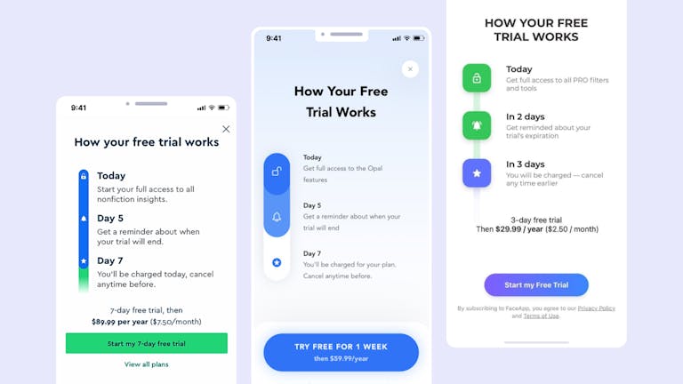
In 2020, the Blinkist team implemented a new paywall design, utilizing a timeline format that clearly outlined the user’s journey throughout the trial period. This simple, yet effective, approach significantly improved user satisfaction and yielded impressive results:
- Conversion to trial increased by 23%
- Conversion to paid subscription increased by 4%
5. Use timing strategically
When optimizing the deployment of your paywall, it’s not only about where it’s placed but also when it appears. Timing plays a crucial role here, factoring in user engagement, content consumption, and behavioral triggers. By placing the paywall strategically (when users are actively using the app, have benefited from valuable content, or are ready to take action) can greatly boost conversion rates.
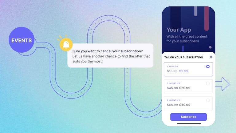
Here are some approaches to help determine the optimal paywall engagement timing:
- Analyze user in-app events and patterns to identify engaged moments
- Gather user feedback to align timing strategies
- Conduct A/B tests to experiment with different timings and refine based on results
- Continuously monitor user behavior and metrics for iterative improvements
Find out what A/B testing is for ASO
6. Introduce an onboarding experience linked to the paywall
App marketers frequently grapple with the challenge of balancing persuasive messaging to drive user purchases while maintaining a seamless user experience. Striking this balance is crucial to prevent annoyance or frustration. However, there’s another approach worth exploring: introducing an onboarding experience linked to your paywalls, which can yield numerous benefits for your app.
- Enhancing user engagement: Onboarding provides an opportunity to engage users right from the start and familiarizes them with the app’s features and benefits. By linking it to the paywall experience, users gain a clear understanding of the value they will receive by making a purchase or subscribing.
- Improved user retention: A well-designed onboarding process can help users quickly grasp the app’s functionality and benefits, increasing the likelihood of them continuing to use the app. When connected to the paywall, it reinforces the value proposition and encourages users to stay.
- Increased conversion rates: By guiding users through a seamless onboarding journey and showcasing the app’s value, the paywall experience becomes more compelling. Users are more likely to convert to paying customers when they have a clear understanding of the benefits they’ll gain.

Remember, during your users’ first visits, like when they’re getting onboarded, they’re most eager to explore your app. Therefore, it’s essential to create a seamless flow that naturally leads them from onboarding to their first encounter with the paywall.
During this journey, make sure users have the opportunity to learn about your app’s unique features, value proposition, and benefits. When you incorporate the paywall seamlessly into the app’s story, users can see how it enhances their experience and adds value. This way, the paywall doesn’t come across as a separate transaction but as a natural part of their journey and exploration within the app.
7. Test and iterate for success
Embracing a continuous “learning mindset” is crucial because user preferences and behaviors are constantly evolving. What works today may not work tomorrow. It helps you identify areas for improvement, discover new opportunities, and refine your strategies over time.
It’s not an easy task. One of the major challenges in paywall testing lies in the time required for development and application release. But if you have the opportunity to equip yourself with the right tools, you can overcome these challenges and optimize your paywall practices by efficiently testing various elements in an agile manner.
To refine your paywall strategies, explore design variations, craft compelling messages, experiment with pricing strategies, placement options, incentives, different CTA button styles, paywall frequency, user segmentation, and social proof. By conducting efficient tests on these elements, you can fine-tune your strategies and uncover new avenues for improvement.
8. Match free-trial length with your app’s discovery time
Providing a free trial is a smart way to let users explore your app’s value without the need to pay upfront. To maximize conversions and revenue, it’s crucial to choose the right trial length. This means finding the sweet spot where users have enough time to fully explore your app’s features.
Every app has its unique discovery time. Some require more time for users to grasp the full potential and benefits they offer, while others can be quickly understood and evaluated.
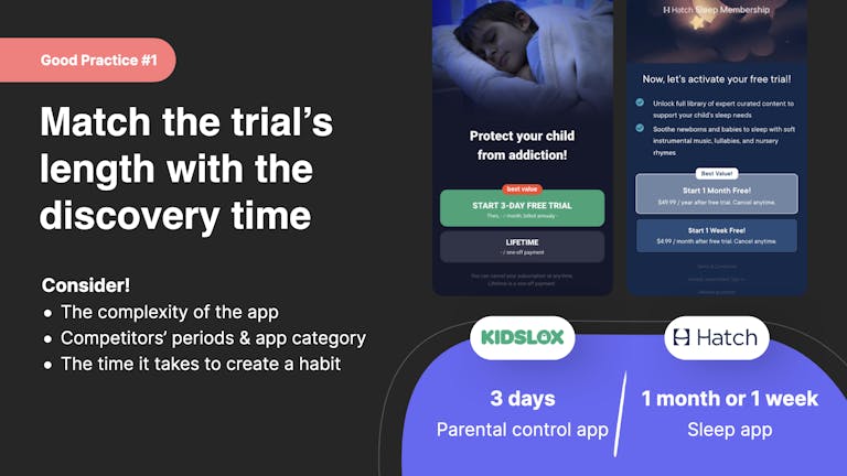
As you evaluate your app’s trial period, think about the app’s complexity, how long it takes for users to see its value, and how they use it. Gather feedback to gain insights into user behavior and preferences. This data-driven approach will help you make informed decisions about the optimal trial length for your app.
You can streamline this process by using simple tools like feedback forms, in-app polls, or even QR codes that link directly to quick surveys. For example, using Uniqode’s QR Code Generator, you can generate a QR code that routes users to a post-trial feedback form—ideal for capturing insights from both engaged and drop-off users without disrupting the app experience.
9. Personalize the experience
Let’s explore some powerful personalization strategies to engage your users. When you tailor the paywall experience, it makes users feel special and helps them see the value in the subscription that best fits their needs:
Step 1: Segment users
Categorize users based on:
- Demographics: age, gender, location, language, and occupation
- Behavior: app usage, actions, and engagement
- Transaction history: past purchases and subscriptions
- Engagement level: active, dormant, or power users
- Psychographics: attitudes, interests, values, and lifestyle preferences
- Customer lifecycle stage: new, trial, or existing
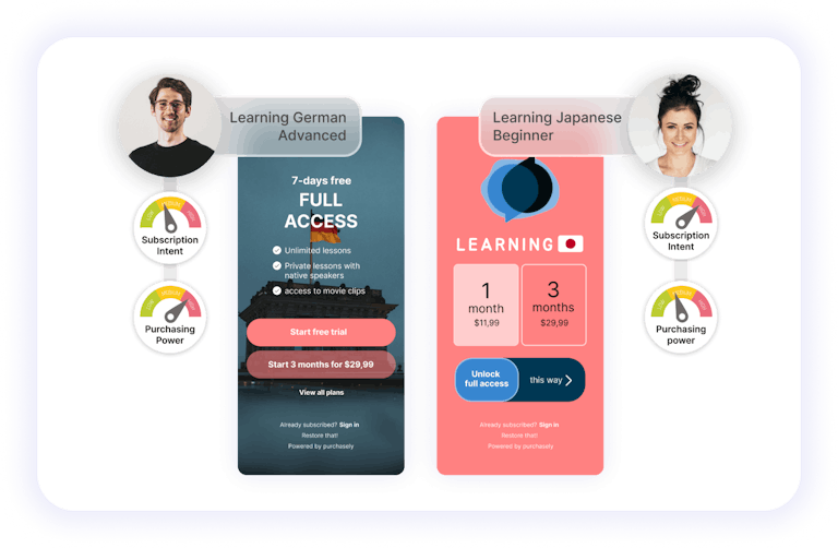
Step 2: Personalize paywall elements
- Messaging: Use language, tone, and content that resonate with each segment’s interests and motivations. Highlight the unique benefits they will gain by subscribing or upgrading to a premium plan.
- Offers: Consider offering segment-focused discounts, exclusive content, or rewards that align with their preferences.
- Timing & placement: Personalization goes beyond just the content of your paywall. Consider the timing and placement of your paywalls as well. Deliver paywalls at strategic moments in the user journey when they are most likely to be receptive to the offer.
10. Use smart growth tools for subscription apps
Optimizing paywalls can feel like reinventing the wheel. But by leveraging smart growth/monetization tools, you can supercharge, expedite your paywall optimization efforts and maximize your app’s revenue with the minimum amount of hassle. Here’s how leveraging smart tools can help you optimize your paywalls effectively:
Boosting efficiency
When it comes to paywall optimization, it can be a significant task. Starting from scratch usually means investing a lot of time and resources.
But, here’s the good news: tools like Purchasely, an all-in-one growth platform designed for subscription apps, can make the process easier. Developers can save time and effort, which they can then use for other crucial aspects of app growth and success.
Data-driven insights
To boost your paywall strategies, make it simple to access insights about your app users and paywall performance. This helps you understand what data is essential to track and monitor and allows you to make informed decisions. It also enables you to refine your paywall optimization strategies effectively.
Seamless integration and scalability
Some tools are designed to seamlessly integrate with various mobile app martech (marketing technology) platforms and monetization frameworks. This ensures smooth implementation and scalability as apps continue to grow. Whether you’re a startup or a large enterprise, the ability to integrate your monetization engine with diverse tools effortlessly can help you scale with minimum effort.
TLDR
To optimize app paywalls for maximum revenue generation, keep these 10 tips in mind:
- Understand the audience by turning paywall screens into a sensor
- Emphasize app value within the paywall screens
- Optimize the aesthetics
- Transparency about your users’ options and your value
- Strategic timing
- Onboarding experience linked to the paywall
- Continuous testing and iteration
- Aligning trial length with your app’s discovery time
- Personalize the paywall experience
- Leverage smart growth tools for subscription apps
These tips serve as a valuable compass for optimizing your app. Remember to embrace experimentation with various tactics and ensure your app resonates with your target audience. The true essence of the experience lies within the product itself. By incorporating these strategies and maintaining a learning mindset, you can drive your app’s revenue to new heights.


 Sukanya Sur

 Osman Soysal

 John Koetsier

 Silvija Lazanin