
How to optimize your app screenshots: best practices
 by Lina Danilchik
App Growth Specialist
— 21 min read
What impact do app screenshots have on mobile marketing? App screenshots are one of the first things users notice when visiting an app store product page, making them a key factor in shaping first impressions. In this blog, we will explore these essential visual elements of each and every app, and share app store screenshots best practices that you can implement to optimize your app store listing and maximize conversions.
Key takeaways
- App screenshots are a critical component of ASO—they directly impact user engagement, conversion rates, and overall app visibility.
- Well-optimized screenshots that clearly showcase the app’s features and benefits can significantly boost conversion rates and increase downloads.
- Research shows that app screenshots directly affect conversion rates, and certain design choices can significantly improve engagement.
- The first three screenshots have the biggest influence as users rarely scroll past them.
- Add short, benefit-driven captions (e.g., “Track your workouts effortlessly” instead of “Workout tracker app”, “Learn new language in 3 months” instead of “Language learning app”).
- Emotion-driven screenshots lead to higher engagement.
- Apps that use bright colors and high-contrast designs see higher conversion rates.
- AppTweak’s ASO Creatives Explorer allows you to explore the creative strategies of other apps in your industry.
- Validate hypotheses about app screenshots via A/B testing.
- Don’t use generic stock images for your app screenshots—this can cause distrust.
- Comply with the App Store and Google Play guidelines.
- Showcase your app’s UI in your app store screenshots.
- Leverage opportunities to create screenshots for different audiences.
What are app store screenshots?
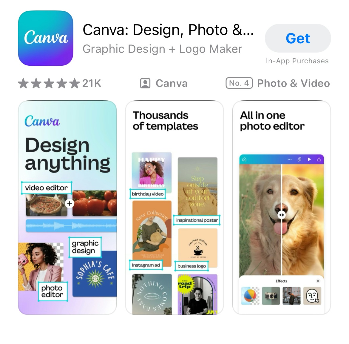
App store screenshots are visual representations of an app displayed on its product page on the App Store and Google Play. These images showcase the app’s interface, features, and functionality, helping users understand what to expect before downloading. For example, gaming apps often provide screenshots that highlight the app’s gameplay or characters.
App screenshots are a critical component of app store optimization. They serve as a marketing tool to attract users, highlight the app’s unique selling points and features for the target audience, and ultimately increase conversion rates.
Purpose of app screenshots on the App Store and Google Play
While both app stores use screenshots to showcase app functionality and design, the way they’re displayed—and their impact—varies slightly between platforms.
The App Store:
- Supports up to 10 screenshots per localization in portrait or landscape mode.
- App screenshots appear prominently at the top of the product page, influencing first impressions.
- Can feature app previews (short videos), making screenshots even more impactful.
- Used in search results, affecting how users perceive the app before tapping.
- Are an integral part of custom product pages, providing tailored creatives for specific audiences.
- Form the foundation for Today tab campaigns in Apple Search Ads.
Google Play:
- Allows up to eight app screenshots per device type (phones, tablets, Android TVs, and Wear OS watches).
- Screenshots appear within the app listing page, requiring users to scroll down to see them.
- Google Play allows A/B testing of different screenshot variations to optimize conversion rates.
- Featured screenshots can be combined with promotional videos to provide more context.
Why are app store screenshots important for ASO?
App screenshots are a critical component of ASO because they directly impact user engagement, conversion rates, and overall app visibility.
1. Make a strong first impression
Screenshots are one of the first visual elements users see when visiting an app store product page.
Relevant and eye-catching app screenshots can immediately capture attention and encourage users to explore an app further.
2. Communicate value at a glance
App screenshots visually communicate what the app does and how it benefits users.
Highlighting key features, UI design, and unique selling points helps connect with the target audience and differentiate the app from competitors.
3. Boosts conversion
Many users decide whether to download an app within seconds, often without reading the description.
Well-optimized app store screenshots that clearly showcase the app’s features and benefits can significantly boost conversion rates and increase downloads.
4. Enhance search rankings indirectly
While screenshots don’t directly affect keyword rankings, higher conversion rates signal relevance to app store algorithms.
So, improved conversion rates can lead to better rankings and increased app visibility in the organic search results.
5. Support custom product pages and ads
On the App Store, screenshots are an integral part of custom product pages and Apple Search Ads Today tab campaigns.
On Google Play, screenshots can be tested using A/B experiments to optimize performance.
Apple App Store screenshot requirements
Before designing for conversion, make sure your App Store screenshots meet Apple’s technical requirements. These include format, resolution, and content rules that help ensure your visuals are eligible for approval and display correctly across devices.
Four key App Store app screenshot specifications:
- Up to 10 screenshots per localization
- Accepted formats: JPEG or PNG (72 dpi, RGB color space)
- No transparency or promotional text (e.g., “Free,” discounts)
- Common screenshot sizes:
- iPhone 6.5”: 1242 × 2688 pixels (portrait)
- Phone 5.5”: 1242 × 2208 pixels (portrait)
- iPad Pro 12.9”: 2048 × 2732 pixels (portrait)
Expert Tip
Google Play screenshot requirements
Just like the App Store, Google Play has specific formatting and sizing rules to ensure app listings look professional across different Android devices. These technical requirements help improve the visual experience and ensure your creatives meet eligibility standards for promotional placements.
Five main Google Play app screenshot specifications
- Accepted formats: JPEG or 24-bit PNG (no alpha transparency)
- Number of screenshots: Up to 8 per device type (phones, tablets, Wear OS, Android TV)
- Resolution: Minimum dimension of 320 pixels; maximum dimension of 3840 pixels
- Aspect ratio: The maximum dimension must not be more than twice the minimum dimension (e.g., 1080 × 1920 for portrait)
- Common examples by device include:
- Smartphones (portrait): 1080 × 1920 pixels
- Smartphones (landscape): 1920 × 1080 pixels
- Wear OS: 384 × 384 pixels
- Android TV banner: 1280 × 720 pixels
Google Play also enforces strict policies around app store screenshot accuracy. Screenshots must reflect real in-app experiences—avoid misleading elements like fake buttons, overly stylized imagery, or captions that don’t appear in the app itself. Device frames are not allowed for Wear OS visuals.
App store screenshots best practices for ASO
Optimizing your app store screenshots is crucial for increasing conversions and driving downloads. Here are some app store screenshots best practices to follow.
How to make app screenshots that increase downloads
Research shows that app screenshots directly impact conversion rates, and certain design choices can significantly improve engagement. Here’s what data and psychology reveal about high-converting screenshots:
1. First look, lasting impact
A study by Google found that users form an opinion about within 50 milliseconds based on visuals alone. This research found that users form an initial “gut feeling” about a website’s visual appeal in as little as 17 to 50 milliseconds. This can be also applied to app screenshots on the app stores.
The first three screenshots have the biggest influence—users rarely scroll past them.
Expert Tip
Place the most compelling features or engaging characters in the first three screenshots to maximize engagement.

2. Optimize visuals for conversion
Apps with visually appealing, feature-focused screenshots can gain a substantial conversion rate increase compared to those with plain UI images.
Additionally, apps that use bold, clear captions tend to have a higher conversion rate than those without text overlays.
Expert Tip
Add short, benefit-driven captions (e.g., “Track your workouts effortlessly” instead of “Workout tracker app”, “Learn new language in 3 months” instead of “Language learning app”).Bonus: If you already have a strong brand recognized on the App Store or Google Play, take advantage of it and place your insignia in the first screenshot for social proof.
Ensure the insignia is subtle yet visible, without distracting from the app’s core features.

3. Utilize emotion-driven screenshots for higher engagement
Neuromarketing studies show that users respond better to emotions in visuals than to plain interface designs.
We recommend using human-centered designs—show people using the app in real-life scenarios.

4. Bright colors and high contrast drive more clicks
Apps that use bright colors and high-contrast designs see higher conversion rates.
Blue and green hues tend to convey trust, while red and orange create urgency and excitement.

5. Don’t forget dark mode and localization
If your app supports dark mode, consider showing it in screenshots. This will highlight your app’s adaptability, appeal to users who prefer dark mode, and make your visuals stand out in app stores where most screenshots are in light mode.
Also, localize screenshots by translating text and adapting visuals for different regions to make your app feel more relevant and trustworthy in specific markets.
6. Capture attention with a video preview
The app preview video appears before screenshots and can boost conversions.
Keep it 15–30 seconds long, showcasing real in-app experiences.

7. Test and iterate app screenshots with A/B testing
Use App Store custom product pages and external A/B testing tools to test hypotheses and different app screenshot variations. Pick the best performing ones and integrate into your app store listing.
AppQuantum increased game downloads by 21.5% with creative A/B testing.
Want to achieve similar results? Try AppTweak for free now.
The creative optimization process for app screenshots
Below, we outline key steps for optimizing app screenshots and how you can refine your ASO strategy for better performance.
1. Analyze your category
Look at what’s trending in your category and analyze the top-performing apps. This step is crucial as it provides insights into what’s working in your industry, what creatives or metadata competitors are using, and how you can position your app to stand out during high-traffic periods like holidays.
You can browse the creatives of the most popular apps and games on the stores. In one view, compare the screenshots, feature graphics, in-app events, and promotional content of top apps in any category.
Explore general design trends that can help capture user attention. For example, the Pantone Color of the Year 2025, Mocha Mousse, is a rich and inviting evocative soft brown that you could incorporate into your app screenshots to create a trendy look.
2. Perform a competitor analysis
Identify your competitors, and analyze their ASO strategies, user feedback, and pricing models to uncover potential gaps your app can fill. Then, monitor their keywords and metadata updates to ensure your app has the edge for high-performing keywords.
For a deep dive, check out our guide on how to perform an app competitor analysis.
Tip: AppTweak’s ASO Creatives Explorer allows you to explore the creative strategies of other apps in your industry.
3. Create your hypothesis
Once you’re aware of the current design trends, it’s time to formulate hypotheses to test. You can create hypotheses about your first screenshot, captions, features that matter most for your target audience, or game layout that immediately captures players’ attention.
4. A/B test elements of your app screenshots
Next step is to validate your hypotheses about app screenshots via A/B testing. A/B tests will help you determine which iterations drive the most conversions and engagement.
Make sure to test only one hypothesis at a time. If you test multiple changes at once, you won’t know which specific element contributed to the improvement.
Expert Tip
Focus on high-impact elements. Prioritize testing the first screenshot, captions, color schemes, and feature highlights as these have the greatest influence on user decisions.5. Implement and measure impact
ASO is a continuous process, so you can’t just upload your app screenshots once and forget about them. Your app will evolve with new features, competitors will introduce new strategies, and design trends will continue to change.
So you need to constantly analyze your app screenshots, as well as other ASO efforts.
Incrementality Analysis by AppTweak is something you’re looking for if you’d like to rely on data instead of your gut feeling, and understand how new app screenshots, and videos actually affect installs.
Incremental growth helps you accurately measure the true impact of your screenshot changes on conversion rates. Instead of relying on surface-level improvements, incrementality testing isolates the effect of new screenshots from external factors like seasonality, ad spend, or algorithm changes.
When to measure incrementality for app screenshot tests:
- Before implementing major design changes:
Establish a baseline for comparison. - After launching new screenshots:
Determine if the update truly improved conversion rates. - When external factors may influence performance:
For example, examine a competitor’s update, a new iOS/Android release, or seasonal shifts. - At regular intervals:
Since ASO is an ongoing process, periodic incrementality checks help ensure long-term gains.
Common mistakes to avoid in app screenshots
Here’s a list of common mistakes in app screenshot development that you’ll want to avoid.
1. Text-heavy screenshots
While text can be useful for highlighting key features, overloading your screenshots with too much text can overwhelm users. Users typically scan images quickly. Instead of lengthy sentences, keep captions concise and impactful, making sure they clearly communicate the app’s benefits, unique selling points, and call-to-action.
2. Using generic stock images
Generic stock images can feel disconnected from the actual experience of using the app, which may lead to distrust. Users want to see real app functionality, not something that looks staged or irrelevant. Instead, use actual screenshots of your app, or feature people actively using the app to give a more relatable portrayal of its features and benefits.
3. Ignoring contrast and readability
Poor contrast between text and background or low readability in your app screenshots can quickly turn users away. If users can’t easily read the captions or identify key features, they’ll most likely leave your app store listing. Ensure the font size is appropriate for all devices, and avoid cluttering the screen with excessive text or graphics. Also, don’t forget to optimize for dark mode.
4. Not using all available screenshot slots
Use the maximum number of screenshots allowed (10 for the App Store, and eight for Google Play) to display a range of key functionalities, and unique selling points. This helps potential users get a better idea of what the app does and increases the chances of them being intrigued enough to download.
5. Not aligning screenshots with user intent
Your screenshots should align with the user’s goals and needs when searching for an app. If your screenshots don’t clearly convey the value of your app, users may quickly lose interest. For example, if your app is designed for productivity, make sure the screenshots highlight key features like task management, ease of use, and efficiency.
6. Not showcasing the app’s UI
For many apps, it’s crucial to demonstrate the real user experience. This approach is effective because users can see the features as they will appear in the app. This builds trust and allows users to easily visualize how they would interact with the app.
How to create engaging screenshots
This guide wouldn’t be complete without tips on creating engaging and high-converting app screenshots.
Step 1: Define your key message
Before you start designing, clearly identify the key message you want to convey. Focus on the most important features or benefits of your app that will resonate with users. What makes your app stand out? Why should users download it? Make sure your screenshots highlight those unique aspects.
Step 2: Choose a consistent design style
Your screenshots should reflect a consistent design style that aligns with your app’s branding. This includes using the same color palette, fonts, and visual elements that appear in your app and marketing materials.

Step 3: Add text overlays and branding
Text overlays can help explain key features or guide users through the app’s functionality. Keep the text short, impactful, and easy to read, as users typically scan screenshots quickly. Additionally, include your logo or brand insignia subtly to reinforce brand recognition. Just make sure the text doesn’t clutter the screenshot.
Step 4: Ensure compliance with App Store/Google Play rules
Each app store has its own set of guidelines and requirements for app screenshots. Be sure your images comply with the App Store and Google Play policies, including size, resolution, and prohibited content (like misleading visuals or irrelevant stock images). Adhering to these rules will ensure your app is eligible for approval and prevent any delays in the app’s launch.
App screenshot examples and inspiration
Let’s take a look at some app screenshots examples by category
Gaming apps

Some games opt for landscape screenshots to better reflect their unique game layouts and characters. This approach works particularly well for games with intricate designs, wide environments, or action-packed scenes that require more space to showcase.
Utility apps
First screenshots of utility apps clearly convey key features and selling points, like ease of use or speed. Note that instead of flash visuals, utility apps often use screenshots to build trust and demonstrate immediate value to the user.

First screenshots of utility apps clearly convey key features and selling points, like ease of use or speed. Note that instead of flash visuals, utility apps often use screenshots to build trust and demonstrate immediate value to the user.
Lifestyle apps
Lifestyle apps are on the other end of the visual spectrum from utility apps. These apps focus on aesthetics, mood, and brand identity, showcasing visually appealing designs, aspirational imagery, and benefits that align with the user’s lifestyle or values. Whether it’s wellness, dating, home decor, or fashion, these apps aim to create an emotional connection right away.

Finance apps
First screenshots of finance apps focus on establishing truth and authority, as people want security when it comes to their money. These apps often highlight core features like expense tracking, investment insights, or savings tools and pair them with reassuring visuals that emphasize security, clarity, and control. The goal is to immediately signal credibility while demonstrating how the app helps users make smarter financial decisions.

Advanced ASO strategies using app screenshots
To truly optimize your app’s presence on the App Store and Google Play employ the following ASO strategies when developing app screenshots.
1. Focus on user journey and intent
Your screenshots should align with the user’s intent. Focus on the goals they have when downloading your app.
- For productivity apps, emphasize time-saving features and valuable functionality for daily routine tasks.
- For gaming apps, showcase in-game action or narrative elements.
- For health or fitness apps, highlight progress tracking or personalized features.

2. Create customized screenshots for different audiences
With custom product pages the App Store) or store listing experiments (Google Play), you can create targeted screenshots for different user segments. For example:
- Feature-based screenshots for experienced users who are familiar with the app category.
- Beginner-focused screenshots highlighting simple, easy-to-use aspects for new users.
3. Showcase app updates in screenshots
When you release a significant update, it’s essential to communicate those changes through your screenshots. This can be done by:
- Highlighting new features directly within your screenshots.
- Showing before-and-after images of the app’s UI if there’s a redesign or added functionalities.
- Using a “What’s new” banner to draw attention to the updates. This keeps your current users informed and attracts new users who want the latest version.
4. Use emotionally engaging visuals
Visual storytelling plays a major role in app engagement. Use screenshots that not only show functionality but also connect with users on an emotional level.

How to level-up the emotion in your screenshots:
- Gamify your visuals for gaming apps by showing characters, in-game rewards, or achievements.
- Depict lifestyle-oriented visuals for fitness or meditation apps, focusing on the transformation users can expect.
- Show problem-solving scenarios for utility apps by demonstrating how your app can resolve common user pain points.
5. Show social proof and reviews
Incorporate user testimonials or ratings directly in your screenshots to build trust and credibility. Displaying a high rating (e.g., “4.8 out of 5 stars”) or a positive user review can help influence potential users by showing that others have had a positive experience with your app.
Conclusion
App screenshots are a key part of your app store product page and play a big role in how users perceive your app. They grab attention right away and have a huge impact on whether someone decides to download your app. So, don’t overlook this! Keep an eye on trends in your niche and the market, A/B test different ideas, and apply your findings to your app store listing. And of course, don’t forget to follow the best practices for app screenshots from this guide. Good luck with making app screenshots work for you!
To explore how AppTweak can help you A/B test your screenshots and monitor their performance, start your free trial now!
FAQ
Let’s go over the most common questions related to app screenshots and best practices for optimizing them.
What are the size requirements for App Store screenshots?
Here are app screenshot requirements for the App Store.
- iPhone (6.5” display) – 1242 × 2688 pixels (Portrait) / 2688 × 1242 pixels (Landscape)
- iPhone (5.5” display) – 1242 × 2208 pixels (Portrait) / 2208 × 1242 pixels (Landscape)
- iPad (12.9” display) – 2048 × 2732 pixels (Portrait) / 2732 × 2048 pixels (Landscape)
- iPad (11” display) – 1668 × 2388 pixels (Portrait) / 2388 × 1668 pixels (Landscape)
For a complete list of sizes, refer to Apple’s official guidelines.
How many screenshots can I upload to the App Store and Google Play?
The number of screenshots available for each app store differs.
App Store: Up to ten screenshots per localization.
Google Play: Up to eight screenshots per device type (phones, tablets, Wear OS, etc.).
What file formats are accepted for app screenshots?
Both the App Store and Google Play accept: JPEG and PNG (24-bit, no alpha transparency for Google Play).
Can I use the same screenshots for the App Store and Google Play?
Not always. While some images may work across both platforms, each store has different size and formatting requirements.
App Store requires device-specific resolutions, while Google Play allows flexible dimensions.
Promotional text in screenshots is not allowed on the App Store but may be used with limitations on Google Play.
Google Play supports device types like Android TV and Wear OS, requiring additional screenshots.
What are the best practices for Google Play screenshots
- Focus on the first three screenshots.
- Add short, benefit-driven captions and CTAs.
- Show real UI, avoiding misleading imagery.
- Include Google Play promo video thumbnail.
What are best practices for iOS app screenshots
- Showcase the most important features first (the first 2-3 screenshots matter most).
- Add short, impactful captions.
- Pay attention to screenshot sizes and resolutions (latest requirements for iPhone, iPad, etc.).
- Rely on device-specific guidelines (e.g., iPhone 16, iPad Pro updates).
- Upload up to 10 screenshots.
- Maintain a consistent theme and branding.
- Test different versions to find the best-performing visuals.
Should I include text in my app screenshots?
Yes, include a caption highlighting key features or unique selling proposition, and CTA. But keep it short and sweet, avoid clutter, and use readable fonts.
How do I A/B test app screenshots?
Use built-in A/B testing tools like Store Listing Experiments on Google Play and PPO on the App Store. You may also take advantage of third-party A/B testing platforms to test your app screenshots. So, try AppTweak’s App Page Preview feature to see how your app page would look like on real devices in both light and dark modes.
Can I include a video instead of screenshots?
Yes, you can include a video preview instead of (or alongside) screenshots, but whether it’s the best choice depends on your app and audience. Use app preview to showcase gameplay, app experience, or to demonstrate complex features.

More articles in Start ASO

 Lina Danilchik

 Elizabeth Devine

 Micah Motta

 Alexandra De Clerck

 Phuc Nguyen

 Oriane Ineza